Published on 2025-06-29T20:10:46Z
What is an Above-the-Fold CTA? Examples and Best Practices
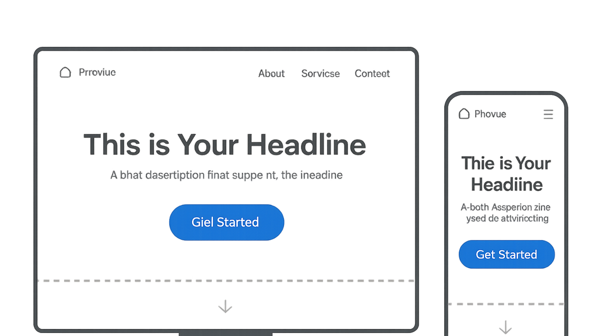
The above-the-fold Call-to-Action (CTA) refers to any clickable element designed to prompt user action that appears in the portion of a webpage visible without scrolling. These CTAs are strategically placed for maximum engagement, conversion optimization, and immediate impact on user behavior. In the context of CRO (Conversion Rate Optimization), UX (User Experience), and SEO (Search Engine Optimization), above-the-fold CTAs play a pivotal role by capturing attention, guiding user flow, and reducing bounce rates. A well-designed above-the-fold CTA balances compelling copy, clear visual hierarchy, and responsive design to ensure seamless interaction across devices. Tools like Prevue.me can provide actionable critiques to refine your CTA for optimal lead generation, accessibility, and overall site performance.
Above-the-fold cta
A prominent CTA positioned in the initial visible area to boost engagement and conversions.
Why Above-the-Fold CTAs Matter
Above-the-fold CTAs are crucial because they capture the user’s attention the moment a page loads. By positioning the primary action prompt where it’s immediately visible, businesses can reduce friction and guide visitors toward desired interactions before they lose interest or get distracted.
-
Enhanced visibility
Elements placed above the fold don’t require scrolling, ensuring that the CTA is seen by nearly every visitor upon landing.
- Fold line definition:
The fold line is the boundary between the visible area and the portion requiring scrolling. Exact placement varies by device and screen size.
- Fold line definition:
-
Impact on conversion rate
Prominent CTAs reduce friction in the user journey, leading to higher click-through rates and conversions.
- Immediate engagement:
A clear action prompt encourages users to engage without delay, improving session metrics.
- Reduced bounce rates:
By offering a next step right away, users are less likely to leave the page prematurely.
- Immediate engagement:
Key Characteristics of Effective Above-the-Fold CTAs
An effective above-the-fold CTA combines persuasive copy, strong visual hierarchy, and mobile-first design principles. Each aspect plays a role in drawing attention, conveying value, and encouraging action.
-
Clear and concise copy
Use direct, action-oriented language that communicates the benefit and next step in as few words as possible.
- Use strong verbs:
Start with verbs like “Get,” “Download,” or “Start” to create a sense of action.
- Keep it short:
Aim for under five words to ensure quick comprehension.
- Use strong verbs:
-
Visual hierarchy and contrast
The CTA should stand out through size, color, and positioning against the background.
- Color contrast:
Choose button colors that contrast with the surrounding elements to draw the eye.
- Size and placement:
Ensure the CTA is large enough to tap on mobile and placed near compelling imagery or headlines.
- Color contrast:
-
Mobile responsiveness
Design CTAs that adapt to different screen sizes and input methods.
- Thumb-friendly size:
Make buttons large enough for easy tapping on touch screens.
- Adaptive layout:
Use flexible grid or responsive CSS to maintain prominence across devices.
- Thumb-friendly size:
Examples of Above-the-Fold CTAs
Real-world examples can illustrate how different brands implement above-the-fold CTAs for maximum impact.
-
Prevue.me
prevue.me places its primary CTA “Get Actionable CRO Insights” centrally in the hero section, using a bold button color and concise subheading to communicate immediate value.
- Html snippet:
<button class="cta-button" style="background-color:#ff6f61;color:#fff;padding:1rem 2rem;font-size:1.25rem;">Get Actionable CRO Insights</button>
- Html snippet:
-
Mailchimp
Mailchimp’s homepage features a “Sign Up Free” CTA in a contrasting color, accompanied by a minimalist design to reduce distractions.
- Key takeaway:
Positioning and simplicity drive focus; only essential elements surround the CTA.
- Key takeaway:
Optimizing and Testing Your Above-the-Fold CTA
Continual testing and refinement ensure that your above-the-fold CTA performs at its best. Leverage data-driven tools to identify improvements.
-
A/b testing
Experiment with different copy, colors, and placements to find the most effective combination.
-
Prevue.me critiques
Use prevue.me to get automated insights on your CTA’s UX, accessibility, and SEO, including heatmaps and copy analysis.
- Actionable feedback:
Receive prioritized recommendations for button text, color contrast, and placement.
- Seamless integration:
Embed prevue.me widgets directly on staging environments for real-time critique.
- Actionable feedback: