Published on 2025-06-29T21:39:56Z
What is an eCommerce Deal Banner? Examples & Best Practices
An eCommerce Deal Banner is a prominent on-page element designed to showcase a limited-time offer or promotion across an online store. Typically placed above the fold, it grabs attention with bold typography, contrasting colors, and concise messaging that highlights the deal’s value. By tapping into urgency cues like countdown timers or “limited stock” alerts, deal banners create a sense of FOMO (fear of missing out) that drives clicks and conversions. On sites optimized for CRO, UX, and SEO — such as those audited by Prevue.me — deal banners are fine-tuned for speed, accessibility, and mobile responsiveness. In this article, we’ll explore what makes an effective eCommerce Deal Banner, share real-world examples, and offer best practices to maximize your promotional impact.
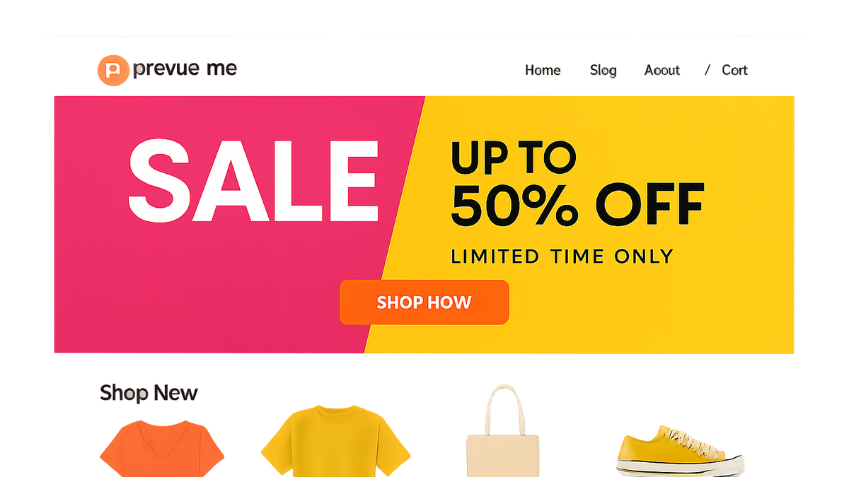
Ecommerce deal banner
An eCommerce Deal Banner highlights special offers to boost visibility, urgency, and conversions on your website.
Importance of Deal Banners
Deal banners serve as a direct line of communication between your store and visitors, spotlighting offers that can significantly impact purchasing decisions. By layering urgency and clear value propositions, they guide users toward high-conversion pathways.
-
Boosts conversions
Deal banners tap into FOMO psychology, encouraging users to act quickly when they see a time-sensitive offer.
- Fomo principle:
Fear of missing out drives faster decision-making and increases click-through rates.
- Fomo principle:
-
Increases visibility
Placing a bold banner above the fold ensures the promotion is immediately noticed, improving engagement metrics.
-
Supports marketing campaigns
Deal banners reinforce messaging from email blasts, social ads, and retargeting campaigns for a cohesive user journey.
Key Elements of an Effective Deal Banner
To maximize impact, an eCommerce deal banner should combine clarity, urgency, and brand coherence. Below are the essential components to consider.
-
Clear value proposition
Articulate exactly what the deal is — e.g., “50% off all shoes” or “Buy one, get one free” — to remove any ambiguity.
-
Strong call to action
Use concise verbs like “Shop Now” or “Claim Offer” to prompt immediate action.
-
Urgency cues
Elements like countdown timers, limited stock messages, or expiration dates heighten the sense of urgency.
- Countdown timers:
Visual timers display remaining time, increasing conversion rates by emphasizing scarcity.
- Countdown timers:
-
Visual contrast & brand consistency
Use colors and typography that align with your brand while ensuring the banner stands out on the page.
-
Mobile responsiveness
Design banners that scale and maintain legibility on smaller screens to capture mobile shoppers.
Best Practices & Examples
Implementing deal banners effectively requires attention to design, placement, and iteration. Here are proven strategies and a sample code snippet.
-
Placement and size
Keep the banner above the fold, spanning full width or centrally positioned to ensure maximum exposure.
-
Use of color & typography
Contrast the banner against page elements; employ bold fonts for headlines and clear supporting text.
-
Html example
<div class="deal-banner" style="background:#ff4c4c;color:#fff;padding:16px;text-align:center;"> <h2>50% Off All Outerwear!</h2> <p>Hurry—sale ends in <span id="timer">02:15:23</span></p> <a href="/collections/jackets" class="cta-button">Shop Now</a> </div> -
A/b testing & iteration
Continuously test variations in copy, color, and placement to identify the highest-performing design.
-
Accessibility considerations
Ensure sufficient color contrast, add descriptive alt text for images, and make CTAs keyboard-accessible.
Common Pitfalls to Avoid
Even small mistakes can undermine the effectiveness of deal banners. Watch out for these frequent issues:
-
Overwhelming design
Too many graphic elements or animations can distract from the core message.
-
Vague messaging
Unclear promotions lead to confusion and low engagement—always specify the offer and conditions.
-
Ignoring mobile users
Non-responsive banners that crop or hide key information frustrate mobile visitors.
-
Neglecting seo
Missing alt text or large unoptimized images can slow page speed and hurt search rankings.
Optimizing with Prevue.me
Leverage prevue.me’s suite of audits to refine your deal banners across CRO, SEO, UX, and accessibility dimensions.
-
Actionable cro feedback
prevue.me evaluates banner placement, copy effectiveness, and CTA clarity to enhance conversion potential.
-
Seo & speed analysis
Identify image optimization issues, missing meta tags, and loading delays that impact search performance.
-
Ux & accessibility critiques
prevue.me checks color contrast ratios, keyboard navigation, and ARIA attributes to ensure compliance.
-
Lead generation insights
Discover friction points in signup forms or newsletter pop-ups embedded in deal banners to boost email capture.