Published on 2025-06-29T21:52:56Z
What is an eCommerce Homepage CTA? Examples & Best Practices
An eCommerce Homepage CTA (Call to Action) is a strategically placed prompt on an online store’s homepage directing visitors to complete a specific action, such as shopping, signing up, or exploring featured products. It serves as the focal point for guiding user behavior, improving conversion rates, and supporting marketing goals.
Key elements include:
- Placement above the fold
- Compelling copy
- Contrasting design
- Mobile responsiveness
Effective CTAs are clear, visually distinct, and aligned with user intent. Tools like Prevue.me provide actionable critiques on CTA clarity, design compliance, and accessibility, enabling ongoing A/B testing and optimization to ensure maximum engagement.
Ecommerce homepage cta
A strategic call to action on an eCommerce homepage that drives user engagement, conversions, and lead generation.
Understanding eCommerce Homepage CTAs
This section explains what eCommerce homepage CTAs are and their role in guiding user behavior and influencing conversions.
-
Definition
An overview of what constitutes a homepage CTA in eCommerce and how it differs from other CTAs on product or checkout pages.
-
Primary vs secondary ctas
Distinguishes between the main action you want a visitor to take (primary CTA) and supporting actions (secondary CTAs).
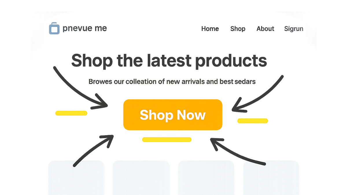
- Primary cta:
The main action button such as ‘Shop Now’ or ‘Start Free Trial’, designed for maximum emphasis.
- Secondary cta:
Supporting actions like ‘Learn More’ or ‘Contact Sales’ that offer alternative paths without distracting from the primary goal.
- Primary cta:
Importance in CRO, UX, and SEO
Explores how homepage CTAs impact Conversion Rate Optimization, User Experience, and Search Engine Optimization on eCommerce sites.
-
Impact on conversion rates
Well-designed CTAs can significantly increase conversions by clearly guiding users to desired actions, reducing friction and drop-off.
-
Ux considerations
CTAs should follow design principles such as contrast, placement, and readability to ensure seamless user interaction.
-
Seo benefits
Strategically labeled CTAs with descriptive text can improve on-page relevance and contribute to better crawlability.
Best Practices for eCommerce Homepage CTAs
Key guidelines for creating effective CTA buttons, including design, copywriting, placement, and testing methods.
-
Placement and visibility
Position CTAs above the fold and in intuitive spots where user attention naturally lands (e.g., near hero banners or product highlights).
- Above the fold:
Ensure the primary CTA is immediately visible without scrolling to capture early engagement.
- F-pattern layout:
Align CTAs following common eye-tracking patterns to enhance discoverability.
- Above the fold:
-
Copywriting tips
Use concise, action-oriented language that clearly communicates the value proposition (e.g., ‘Get 20% Off Today’).
-
Design and color contrast
Select colors that stand out against the background, maintain brand consistency, and adhere to accessibility standards.
-
Testing and optimization
Implement A/B tests to compare CTA variations in copy, color, and placement, iterating based on performance data.
- A/b testing:
Run controlled experiments on different CTA versions to identify which yields higher clicks and conversions.
- A/b testing:
Examples and Prevue.me Critiques
Real-world CTA examples and how prevue.me can analyze and critique them for CRO, UX, SEO, and accessibility improvements.
-
Lead generation cta
A CTA designed to capture visitor information, such as newsletter sign-ups or free trial requests.
Example HTML:
<button class="cta-primary">Start Your Free Trial</button>prevue.me Insight: Highlights button text clarity, ensures color contrast meets WCAG standards, and suggests microcopy refinements for urgency.
- Actionable critiques:
prevue.me evaluates clarity, button size, and recommended ARIA labels for screen readers.
- Lead capture optimization:
Suggestions to reduce form fields and add social proof to increase sign-up rates.
- Actionable critiques:
-
Product promotion cta
Promotional CTAs encourage purchases or product exploration, often highlighting discounts or new arrivals.
Example HTML:
<a href="/sale" class="cta-secondary">Shop Summer Sale</a>prevue.me Insight: Checks SEO-friendly link text, mobile tap area size, and recommends urgency indicators like countdown timers.
- Seo and link text:
Advice on using descriptive link text to improve keyword relevance and avoid generic phrases.
- Mobile accessibility:
Ensure touch targets are at least 44x44px and color contrast ratios exceed 4.5:1.
- Seo and link text: