Published on 2025-06-29T22:04:57Z
What is a Product Page Size Guide? Examples for Optimization
A Product Page Size Guide outlines recommended dimensions and file size thresholds for all visual and textual elements on an e-commerce product page. It ensures fast load times, improved SEO, and a seamless user experience across devices. By defining standard image resolutions, video limits, and code budgets, teams can balance visual appeal with performance. Tools like Prevue.me provide automated audits and actionable critiques to help you stay within these guidelines. Adhering to a size guide boosts conversions, reduces bounce rates, and maintains accessibility compliance.
Product page size guide
Recommended dimensions and file size best practices for product pages to optimize performance and conversions.
Why Product Page Size Matters
Page size directly impacts load speed, user engagement, and search rankings. Oversized pages frustrate visitors and increase bounce rates, while lean pages improve conversions. A structured guide helps balance visual appeal with performance.
-
Load time & user experience
Pages loading within 2–3 seconds keep users engaged. Every additional second of delay can reduce conversions by ~7%.
- Performance metrics:
Track FCP (First Contentful Paint) and LCP (Largest Contentful Paint) to gauge experience.
- Performance budgets:
Set a total page weight target (e.g., under 2 MB) to guide development.
- Performance metrics:
-
Seo & crawl efficiency
Search engines favor fast pages. Smaller pages improve crawl rates and ranking potential.
- Mobile-first indexing:
Google indexes mobile pages first, making mobile performance essential.
- Optimized asset metadata:
Use descriptive alt text and captions alongside small image files.
- Mobile-first indexing:
Core Components of the Size Guide
A comprehensive guide details each element’s recommended specs—ensuring consistency, accessibility, and scalability.
-
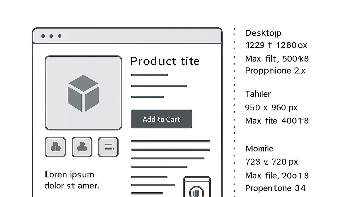
Product images
Define resolutions, formats, and compression ratios for optimal quality and size.
- Desktop vs. mobile dimensions:
Desktop: max 800×800 px; Mobile: max 600×600 px.
- File formats:
Use WebP or compressed JPEG for photos; SVG for icons.
- Compression targets:
Aim for 70–80% JPEG quality to balance clarity and size.
- Desktop vs. mobile dimensions:
-
Videos & animations
Set resolution and duration limits to avoid slowing page loads.
- Resolution:
Recommend up to 720p for autoplay snippets under 2 MB.
- Format & codecs:
Use MP4 (H.264) for broad compatibility and small footprint.
- Resolution:
-
Css, javascript & fonts
Minify, bundle, and subset assets to cut requests and weight.
- Minification:
Strip whitespace, comments, and unused code.
- Font subsetting:
Include only required glyphs and weights.
- Minification:
Implementing with Prevue.me
prevue.me automates audits and delivers prioritized, actionable recommendations aligned with your size guide.
-
Automated size audits
Scan pages to pinpoint oversized images, videos, and code inefficiencies.
- Real-time metrics:
Instantly view page weight breakdowns, load times, and asset impact.
- Real-time metrics:
-
Actionable recommendations
Receive CRO-focused fixes for compression, lazy loading, and minification.
- Lead-gen optimizations:
Balance visual impact with speed to maximize conversions.
- Accessibility checks:
Ensure compressed assets retain alt text, ARIA labels, and contrast ratios.
- Lead-gen optimizations:
Maintaining Your Size Guide
A living document should evolve with design trends, device updates, and performance targets.
-
Version control
Store your guide in a shared repository (Git, Confluence) to track changes.
-
Regular audits
Schedule monthly prevue.me scans to enforce budgets and catch regressions.
-
Cross-team collaboration
Engage designers, developers, and marketers in periodic reviews.