Published on 2025-06-29T20:38:51Z
What is Sign-Up Confirmation? Examples and Best Practices
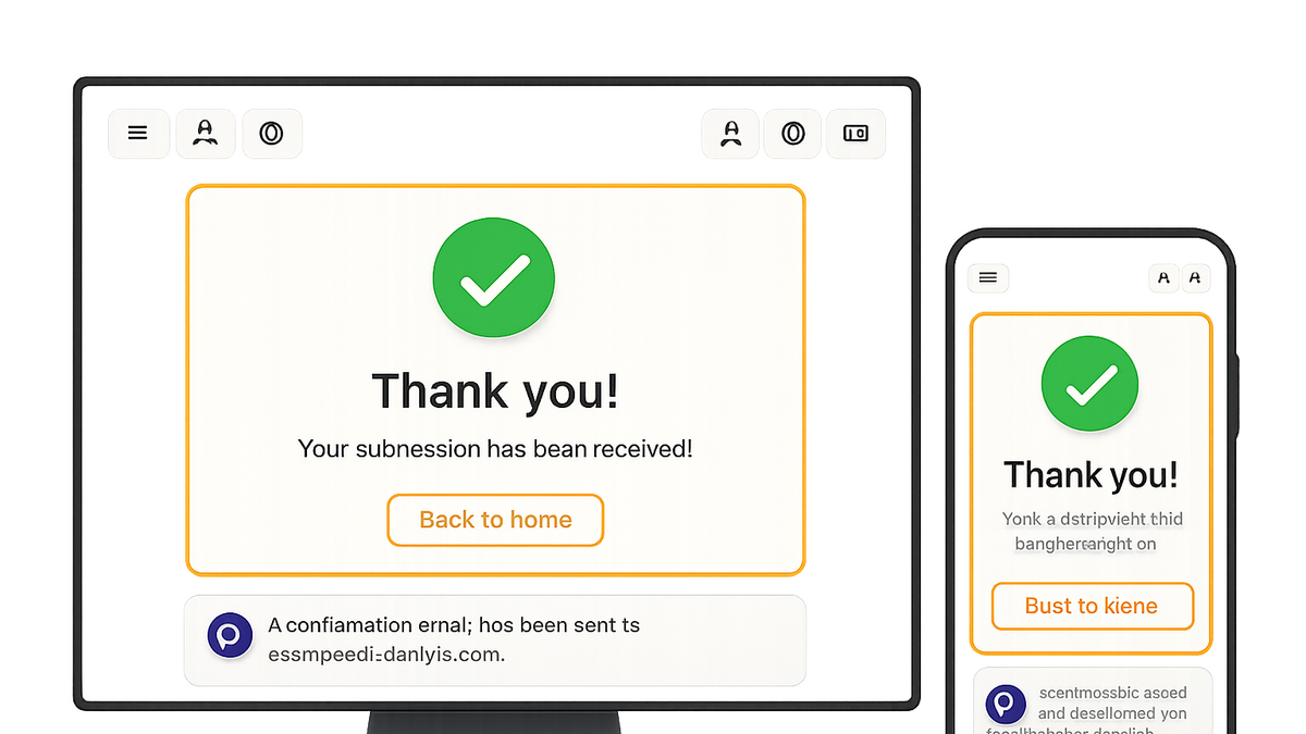
In the context of website optimization for conversion rate (CRO), user experience (UX), and search engine optimization (SEO), a sign-up confirmation is a message delivered immediately after a user registers for your service or newsletter. This can take the form of a confirmation web page, an email, or even an SMS. Its primary goals are to acknowledge successful registration, verify user intent, and guide the user toward the next action—be it email verification, onboarding, or exploring your platform.
Well-crafted confirmations reduce uncertainty, increase user trust, and set expectations clearly. They also present opportunities for additional optimization: tracking user behavior, testing messaging and design elements, and reinforcing brand consistency. When designed with accessibility and SEO in mind, confirmation pages and emails can further improve organic visibility and inclusivity.
Using tools like Prevue.me, teams can get actionable critiques across CRO, UX, SEO, accessibility, and lead generation, ensuring every aspect of the confirmation experience is finely tuned for maximum impact.
Sign-up confirmation
A sign-up confirmation acknowledges user registration and guides next steps, vital for CRO, UX, SEO, and lead generation.
Definition and Purpose
This section defines sign-up confirmations and explains why they’re a critical step in the user journey.
-
What is a sign-up confirmation?
A sign-up confirmation is a notification—typically a web page, email, or SMS—sent immediately after a user registers. It acknowledges the action, verifies intent, and outlines next steps.
Why It Matters for CRO, UX, and SEO
Sign-up confirmations influence conversion rates, user satisfaction, and search visibility. Optimizing this touchpoint yields measurable gains.
-
Conversion rate optimization (cro)
A clear confirmation reduces form abandonment and reassures users they’ve successfully signed up, boosting overall conversion rates.
-
User experience (ux)
By guiding users on what to expect next, confirmations reduce confusion and create a smoother onboarding flow.
-
Search engine optimization (seo)
Confirmation pages can be enhanced with metadata, structured data, and crawlable content to improve organic reach and indexing.
Key Components of an Effective Sign-Up Confirmation
Successful confirmations share several core elements that drive engagement and trust.
-
Clear and concise messaging
Use simple language to confirm the action and set expectations—avoid jargon and long paragraphs.
-
Strong call-to-action
Include the next step: verify email, download resources, or explore the dashboard to keep users engaged.
-
Consistent branding and design
Match colors, typography, and tone to your main site or app to reinforce brand identity and trust.
-
Accessibility compliance
Ensure high color contrast, keyboard navigation, and screen reader labels (e.g.,
aria-label) for full inclusivity. -
Analytics tracking
Implement event tracking for page views, button clicks, and conversions to measure performance.
Common Pitfalls to Avoid
Awareness of typical mistakes helps you steer clear of issues that undermine confirmation effectiveness.
-
Generic messaging
Vague text like “Thanks for signing up” without next steps can leave users uncertain.
-
Slow load times
Unoptimized images or scripts delay the confirmation, increasing the risk of user drop-off.
-
Missing verification step
Skipping email verification allows invalid or spam accounts, reducing data quality and engagement.
-
Poor mobile experience
Lack of responsive design frustrates users on phones, harming completion rates and satisfaction.
Example: Using Prevue.me for Actionable Critiques
See how prevue.me analyzes your sign-up confirmation to provide targeted recommendations across CRO, UX, SEO, accessibility, and lead generation.
-
Html snippet analysis
prevue.me highlights optimization opportunities in code. For example:
<div class="confirmation-message" role="alert">
  <h1>Thank You for Signing Up!</h1>
  <p>Please verify your email by clicking the link sent to your inbox.</p>
  <button class="cta-button" aria-label="Resend Verification Email">Resend Verification</button>
</div>
Potential critiques:
- Add
aria-labelfor assistive tech support - Ensure proper heading hierarchy
- Externalize styles for faster load
- Accessibility:
prevue.me recommends adding
aria-labelto buttons for clearer screen reader announcements. - Seo:
Verify that headings (
<h1>) and meta tags are correctly implemented for indexing. - Cro:
Test varying CTA copy and button colors to identify higher click-through rates.
- Performance:
Reduce inline CSS and minify assets to speed up load times.
- Add
-
Ux and copy recommendations
prevue.me suggests microcopy tweaks, like changing ‘Sign Up Complete’ to ‘You’re All Set! Check Your Email.’ to set clearer expectations.
Next Steps and Continuous Optimization
Optimizing confirmations is an ongoing process. Employ these strategies to iterate and improve.
-
A/b testing variations
Experiment with different headlines, button texts, and layouts to discover top performers.
-
Monitoring key metrics
Track email open rates, CTA click-throughs, and post-sign-up engagement to gauge success.
-
Iterative accessibility audits
Schedule regular audits and user testing to maintain and enhance inclusive design.