Published on 2025-06-29T20:27:57Z
What is a Sign-Up Progress Bar? Best Practices and Examples
Sign-up progress bars are UI components that display a user’s advancement through a multi-step registration form. They break complex workflows into manageable chunks, reducing cognitive load and guiding users toward completion. From a Conversion Rate Optimization (CRO) perspective, live progress indicators can decrease form abandonment by up to 20% by setting clear expectations. In terms of User Experience (UX), they improve perceived performance and build user confidence. Additionally, properly structured sign-up flows can provide semantic cues that support SEO by organizing content into crawlable, logical sections. Tools like Prevue.me can audit your progress bar design and copy to surface actionable insights across CRO, UX, lead generation, SEO, and accessibility.
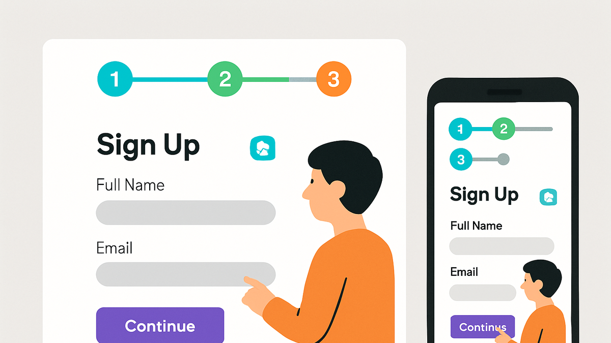
Sign-up progress bar
Visual UI element showing users their current step and overall progress through a multi-step sign-up, boosting conversion and UX.
Why Sign-Up Progress Bars Matter
Sign-up flows with multiple fields often suffer from high abandonment. A progress bar mitigates this by visually guiding users, reducing perceived effort, and building commitment. In CRO, adding a progress indicator can improve form completions by 10–20%. From a UX standpoint, users feel more in control when they see clear milestones. Structured progress bars also break content into logical blocks that can aid SEO by providing semantic anchors for crawlers.
-
Boosts conversion rates
Displaying progress motivates users to finish the process, reducing form abandonment and boosting overall completion metrics.
- Reduced drop-off:
Studies show a 15–25% reduction in form abandonment when users can track their progress.
- Reduced drop-off:
-
Improves user engagement
Clear visual cues keep users informed and engaged, fostering a sense of achievement as they advance through the steps.
-
Sets clear expectations
Users know how many steps remain, which lowers anxiety and increases the likelihood of task completion.
Key Components of an Effective Progress Bar
An effective sign-up progress bar balances clarity, feedback, and design consistency. It should break down the workflow into meaningful steps, reflect the user’s current state, and adapt gracefully across devices. Accessibility, responsive layout, and intuitive labeling ensure all users can follow the process without friction.
-
Clear step indicators
Each step should have a concise label or icon that succinctly describes the required action, helping users anticipate the task ahead.
- Consistent naming:
Use the same terminology throughout the form to avoid confusion.
- Consistent naming:
-
Visual feedback
Progress indicators must visually differentiate completed, current, and upcoming steps using distinct colors or styles.
- Accessible color contrast:
Ensure color choices meet WCAG contrast ratios (minimum 4.5:1) for readability.
- Accessible color contrast:
-
Real-time validation
Immediate feedback on field validity prevents errors from piling up at the final step, improving completion rates.
- Inline error messaging:
Display clear, contextual error messages near fields to guide corrections.
- Inline error messaging:
Best Practices and Common Pitfalls
Implementing sign-up progress bars requires attention to simplicity, performance, and user context. Overloading the interface, ignoring mobile considerations, or neglecting accessibility can backfire. Follow best practices to deliver a seamless, inclusive experience.
-
Keep steps manageable
Limit the number of steps to avoid overwhelming users—ideally 3–5 steps in total.
- Chunk information:
Group related fields logically to minimize perceived effort.
- Chunk information:
-
Optimize for mobile
Design progress bars that adapt to smaller screens, using shorter labels and simplified visuals.
- Responsive layout:
Ensure the bar scales or wraps without truncating step labels.
- Responsive layout:
-
Ensure accessibility
Include ARIA roles and labels so screen readers can interpret progress bars correctly.
- Aria attributes:
Use
role='progressbar'andaria-valuenowto communicate status.
- Aria attributes:
Example: Prevue.me in Action
prevue.me offers tailored critiques for sign-up progress bars, combining insights from CRO, UX, SEO, and accessibility. It analyzes real workflows, highlights friction points, and recommends actionable improvements to maximize lead generation and user satisfaction.
-
Cro-focused feedback
prevue.me evaluates step ordering, call-to-action prominence, and microcopy within the progress bar, identifying changes that can shore up drop-off points.
-
Lead generation optimization
The tool suggests inserting intent-driven incentives at key steps. For example:
<div class='progress-step'> <strong>Step 1 of 3:</strong> Enter your email to unlock a free e-book </div> -
Accessibility insights
prevue.me checks contrast ratios, keyboard navigation, and ARIA labeling to ensure the progress bar meets WCAG 2.1 AA standards, making your form inclusive.