Published on 2025-06-29T20:31:51Z
What is Typography? Examples for Typography in Website CRO/UX/SEO
Typography is the art and technique of arranging type on a page or screen to make written language legible, readable, and visually appealing. In the context of website criticism for Conversion Rate Optimization (CRO), User Experience (UX), and Search Engine Optimization (SEO), typography plays a crucial role in guiding user attention, improving readability, and ensuring accessibility. Well-chosen fonts and precise control over size, color, spacing, and hierarchy can significantly enhance a site’s effectiveness at engaging visitors and driving conversions. Additionally, proper typographic choices can influence a website’s search rankings through improved readability metrics and accessibility compliance. Tools like Prevue.me provide actionable critiques to optimize typography for maximum lead generation, user satisfaction, and SEO performance.
Typography
Typography defines the style and arrangement of text on a website to boost readability, UX, SEO, and conversion rates.
Why Typography Matters in CRO, UX, and SEO
Typography influences how users perceive and interact with content. It impacts readability, guides visual hierarchy, reinforces brand identity, and ensures accessibility. Strong typographic design can reduce bounce rates, increase time on page, and improve conversion rates. Search engines favor sites that are user-friendly and accessible, making typography a key factor in SEO. Proper typographic choices can set a site apart and drive measurable business outcomes.
-
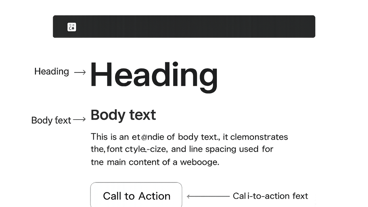
Readability & legibility
Clear, legible text reduces cognitive load and helps users absorb information quickly. Font size, line height, letter spacing, and color contrast all contribute to readability.
- Font size:
Ensure body text is at least 16px for comfortable reading on desktop and mobile.
- Line height:
Use a line height of 1.5–1.75 to create sufficient space between lines.
- Letter spacing:
Adjust tracking to prevent letters from appearing too cramped or too loose.
- Font size:
-
Visual hierarchy
Typographic hierarchy uses variations in size, weight, and style to guide the user’s eye through content in a logical order.
- Heading sizes:
Use clear distinctions (e.g., H1 > H2 > H3) to structure pages and make scanning easier.
- Font weight:
Combine bold and regular weights to emphasize key messages and calls to action.
- Heading sizes:
-
Brand identity
Typography conveys personality and tone, reinforcing brand consistency across touchpoints.
- Typeface selection:
Choose fonts that reflect brand values (e.g., serif for tradition, sans-serif for modernity).
- Consistency:
Limit font families to 2–3 to maintain cohesion and reduce load times.
- Typeface selection:
-
Accessibility
Adhering to WCAG guidelines ensures text is perceivable and understandable for all users, including those with visual impairments.
- Contrast ratio:
Maintain at least a 4.5:1 contrast ratio between text and background.
- Dyslexia-friendly fonts:
Consider typefaces designed for readability by users with dyslexia.
- Contrast ratio:
Best Practices for Implementing Typography
Adopting best practices ensures typography enhances rather than hinders the user experience. These guidelines help you make informed choices about font pairing, responsive scaling, and performance optimization.
-
Font pairing
Combine complementary fonts to create visual interest while maintaining readability.
- Contrasting styles:
Pair a serif heading with a sans-serif body for balance and clarity.
- Mood matching:
Ensure both typefaces share a similar mood or character to avoid clashes.
- Contrasting styles:
-
Responsive typography
Implement fluid scaling so text adapts seamlessly to various screen sizes.
- Css clamp():
Use the clamp() function to set minimum, preferred, and maximum font sizes.
- Viewport units:
Leverage vw/vh units for scalable typography that adjusts to the viewport.
- Css clamp():
-
Web font performance
Optimize font loading to minimize layout shifts and improve page speed.
- Font-display:
Use font-display: swap to reduce invisible text during loading.
- Subsetting:
Include only necessary characters to reduce file size.
- Font-display:
Examples and Critiques with Prevue.me
prevue.me offers automated critiques and actionable insights to refine your typography for better CRO, UX, and SEO outcomes.
-
Font analysis
prevue.me evaluates font choices for readability and brand alignment, highlighting issues like small default sizes or mismatched styles.
- Readability flags:
Detects body text below recommended pixel sizes.
- Style consistency:
Spotlights inconsistencies in font usage across pages.
- Readability flags:
-
Layout & spacing critiques
prevue.me analyzes line height, paragraph spacing, and margin/padding to enhance scannability and reduce cognitive fatigue.
- Line height adjustments:
Suggests optimal line-height ratios based on font size.
- Whitespace guidance:
Recommends spacing to improve visual grouping of content.
- Line height adjustments:
-
Accessibility checks
The tool checks for adequate contrast ratios and compliance with WCAG to ensure text is legible for all users.
- Contrast analyzer:
Measures color contrast and provides suggestions for improvement.
- Screen reader simulation:
Emulates assistive technologies to verify text readability.
- Contrast analyzer: