Published on 2025-06-03T03:42:12Z
BrewIQ Landing Page Review: Clear Messaging Meets Opportunities for SEO and Conversion Growth
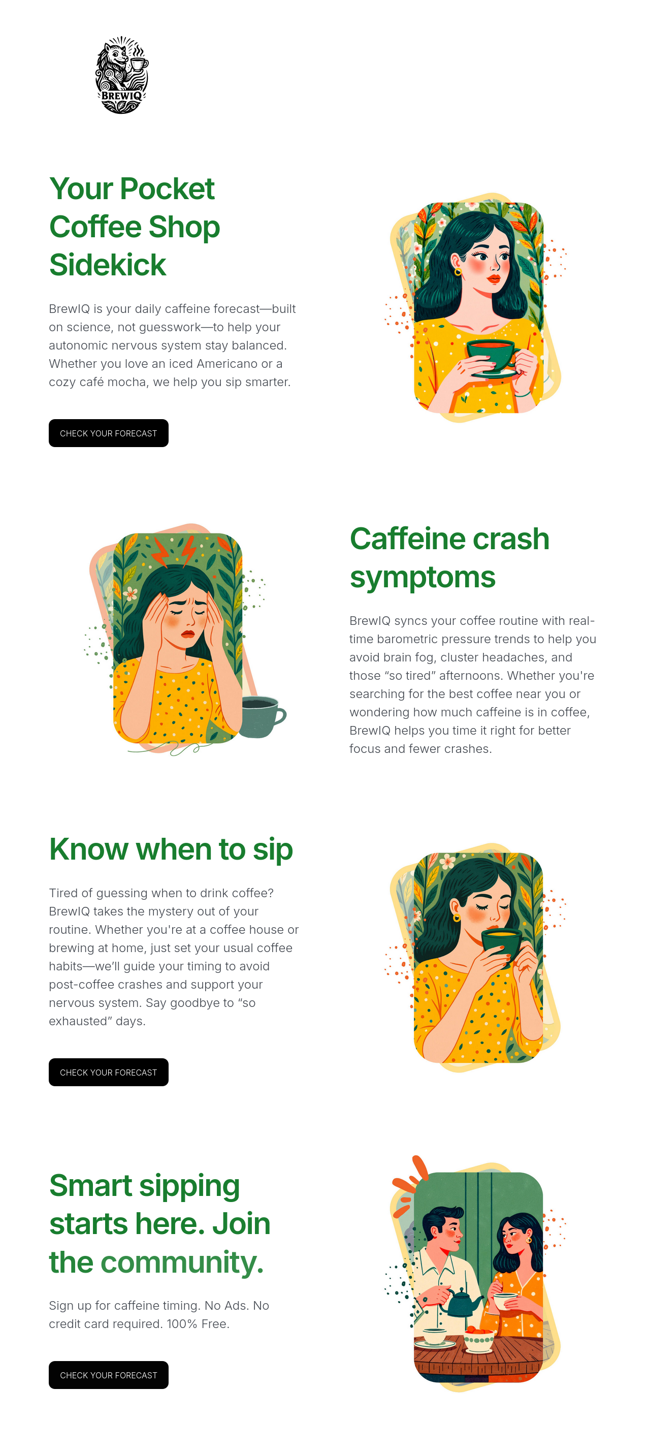
The BrewIQ landing page is thoughtfully designed with clear messaging and a strong value proposition focused on smarter caffeine timing. It uses engaging illustrations and well-placed CTAs to guide users, though opportunities exist to enhance SEO, trust signals, and mobile user experience for better conversions and visibility.
Conversion Rate Optimization (CRO) (80 / 100)
There is no sense of urgency or scarcity on the page, which can be introduced to motivate users to act sooner.
-
Single Conversion Goal & CTA Visibility (Importance level: High)
Ensure the primary CTA button (‘CHECK YOUR FORECAST’) is prominent, above the fold, and repeated logically throughout the page. Adding urgency (like limited spots or limited-time offers) can increase clicks.
-
Minimized Friction in Conversion Process (Importance level: Medium)
Minimize friction by keeping the conversion process simple. Though this can’t be fully evaluated on the landing page alone, clear messaging about ‘No credit card required’ reduces hesitations.
-
Trust Signals & Social Proof (Importance level: Medium)
Currently, trust signals such as testimonials, user reviews, or endorsements are missing. Including these can alleviate user doubts and increase conversions.
-
Urgency or Scarcity Cues (Importance level: Low)
There is no sense of urgency or scarcity on the page, which can be introduced to motivate users to act sooner.
SEO Elements and On-Page Tags (85 / 100)
Images include unique illustrations but checking alt text presence and relevance (not specified here) is important for accessibility and SEO. Make sure alt tags describe the images meaningfully.
-
Title Tag Optimization (Importance level: High)
Title tag is descriptive, benefit-oriented, and includes relevant keywords like ‘Coffee Timing’, ‘Focus’, and ‘Headache Relief’ to help search visibility.
-
Meta Description (Importance level: High)
Meta description clearly states the value and includes relevant keywords, aiding both SEO and click-through rates from search results.
-
Canonical Tag (Importance level: High)
Canonical tag is set to the exact URL, preventing duplicate content issues and consolidating SEO signals.
-
Open Graph & Twitter Card Tags (Importance level: Medium)
Open Graph and Twitter Card tags are fully implemented with images and descriptions to improve social media sharing experience.
-
Structured Data Markup (Importance level: High)
No structured data markup (like Schema.org JSON-LD) is present. Adding markup for organization, product, or FAQ can enhance rich results appearances.
-
Image Alt Text (Importance level: Medium)
Images include unique illustrations but checking alt text presence and relevance (not specified here) is important for accessibility and SEO. Make sure alt tags describe the images meaningfully.
User Experience (UX) Factors (75 / 100)
Although contrast between green text and white background is good, verify all text and interactive elements meet accessibility contrast standards for users with impaired vision.
-
Clear Visual Hierarchy (Importance level: High)
Headings use a distinct green color and sized appropriately to guide the eye. The layout alternates text and images well, maintaining user interest.
-
Mobile Usability (Importance level: High)
Mobile usability should be ensured by responsive design as this is a Carrd.co site which usually adjusts well, but testing on various mobile devices and screen sizes is vital.
-
Page Load Speed (Importance level: High)
Page load speed is potentially fast due to minimal content and optimized illustrations, but testing with tools like Google PageSpeed Insights is recommended.
-
Clutter-Free Layout & Whitespace (Importance level: Medium)
Whitespace around sections creates an airy feel, allowing content to breathe instead of appearing cluttered.
-
Consistency & Expected Interactions (Importance level: Medium)
Consistent interaction design with repeated CTA buttons and predictable navigation helps users understand next steps without surprises.
-
Accessibility & Contrast (Importance level: Low)
Although contrast between green text and white background is good, verify all text and interactive elements meet accessibility contrast standards for users with impaired vision.
Desktop and Mobile Layout Evaluation (80 / 100)
Content and design consistency across devices help maintain brand trust and reduces confusion when switching devices.
-
Mobile Responsiveness & Layout (Importance level: High)
Mobile responsiveness is well handled with clear text and images that resize properly to smaller screen widths.
-
Desktop Layout & Above-the-Fold Content (Importance level: High)
Above the fold on desktop, the main message and primary CTA are visible immediately, capturing user attention early.
-
Cross-Device Consistency (Importance level: Medium)
Content and design consistency across devices help maintain brand trust and reduces confusion when switching devices.
Content Clarity, Call-to-Action Visibility & Trust Elements (75 / 100)
Illustrations add charm but do not overwhelm the text; they support the message well visually.
-
Headline & Value Proposition Clarity (Importance level: High)
Headline “Your Pocket Coffee Shop Sidekick” clearly conveys a unique supportive role BrewIQ plays, engaging users early.
-
Call-to-Action (CTA) Visibility & Design (Importance level: High)
Call-to-action buttons labeled “CHECK YOUR FORECAST” are clear in intent and visible through contrasting black background.
-
CTA Link/Button Functionality (Importance level: High)
CTAs presumably lead directly to the forecast tool or signup, ensuring functional conversion paths.
-
Trust-Building Components (Importance level: High)
Currently missing trust-building components like customer testimonials, expert endorsements, or data security assurances. Adding these strengthens credibility.
-
Concise, Benefit-Oriented Copy (Importance level: Medium)
Copy is benefit-focused explaining caffeine crash symptoms and solution BrewIQ offers, contributing to persuasion.
-
Clarity of Offer & Next Steps (Importance level: Medium)
The offer is clearly free with no ads or credit card required, reducing friction. Next steps are easy to follow via CTAs.
-
Visual Media Supports Message (Importance level: Low)
Illustrations add charm but do not overwhelm the text; they support the message well visually.
Readability Metrics & Content Quality (75 / 100)
Tone is friendly and encouraging, creating emotional appeal without exaggeration.
-
Reading Level & Complexity (Importance level: High)
Reading level seems appropriate for wide audiences seeking caffeine-related wellness tips.
-
Sentence Length & Structure (Importance level: Medium)
Sentence length and structure support clarity without being overly simplistic or complex.
-
Tone and Emotional Appeal (Importance level: Medium)
Tone is friendly and encouraging, creating emotional appeal without exaggeration.
Summary
BrewIQ's landing page clearly communicates its coffee timing benefits with engaging visuals and strong CTAs, but adding trust signals and enhancing SEO could boost performance further.
Sources
Disclaimer: This review was generated for https://brewiq.carrd.co at the request of a user and is intended for site owners, marketers, designers, and engineers to enhance usability and improve conversion rates. It is not intended for end-users, customers, or site visitors.