Published on 2025-07-23T02:01:22Z
Boosting Vibecoding Ideas’ Conversions with Clear CTAs and Trust Signals
Audit of vibecodingideas.io’s homepage focusing on conversion paths, SEO setup, UX flow, and trust-building to drive qualified SaaS leads.
Conversion Rate Optimization
(70 / 100)Reviewing call-to-action clarity, form friction, and trust signals to boost sign-ups.
-
Single, clear primary conversion goal
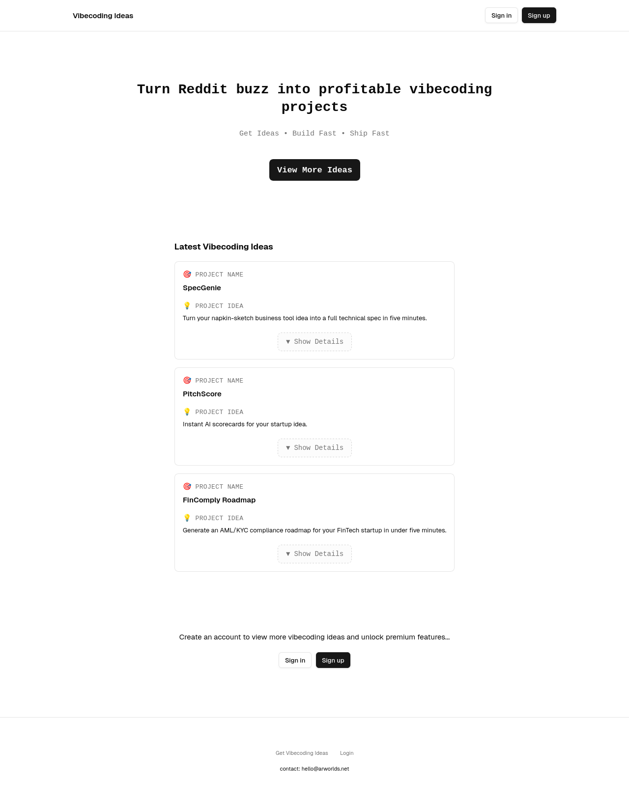
(Importance level: High)The hero CTA reads “View More Ideas” but the primary goal is to get sign-ups. Replace it with a clearer action like “Sign Up to Unlock All Ideas” and secondary link “Browse Examples” to reduce confusion.
-
Strategic placement of CTAs
(Importance level: High)Currently the only above-the-fold button is “View More Ideas.” Add a prominent Sign Up button next to it (or inline email field with submit) to reduce clicks.
-
Simplified signup lead capture
(Importance level: Medium)Instead of sending users to a full sign-up form, consider an inline one-field email capture in the hero (e.g.
<input type="email" placeholder="Your email"/>). -
Visible trust signals
(Importance level: Medium)Although you have reviews via JSON-LD, you don’t surface them on the page. Add a line like “⭐ 4.8⁄5 from 127 developers” beneath the hero to build trust.
-
Urgency/scarcity elements
(Importance level: Low)Introduce a mild urgency (e.g. “Only 5 free AI ideas left this week”) to encourage faster sign-ups without being spammy.
SEO & Meta Elements
(85 / 100)Ensuring all meta, schema, and social tags are complete, correct, and optimized for your target keywords.
-
Optimized title tag
(Importance level: High)Title is descriptive but could include high-intent keywords like “Reddit SaaS Startup Ideas” at the start for better ranking.
-
Compelling meta description
(Importance level: High)Meta description is within length, but adding a direct CTA (e.g. “Start building today.”) can boost click-through rates.
-
Correct canonical implementation
(Importance level: High)Your canonical tag is correct and avoids duplication. No change needed.
-
Complete social sharing tags
(Importance level: Medium)Open Graph and Twitter tags are present. You could add
article:modified_timeif content updates frequently. -
Enhanced structured data
(Importance level: High)You have SoftwareApplication, Organization, and FAQPage schemas. Adding a WebSite schema with
SearchActionand a BreadcrumbList improves discoverability. For example:{"@context":"https://schema.org","@type":"WebSite","url":"https://vibecodingideas.io","potentialAction":{ "@type":"SearchAction","target":"https://vibecodingideas.io/search?query={search_term_string}","query-input":"required name=search_term_string"}} -
Keyword-rich image alt texts
(Importance level: Medium)Ensure your hero image and any other visuals include descriptive
alttext (e.g.alt="Dashboard of AI-powered coding ideas").
User Experience (UX)
(75 / 100)Focusing on how users perceive and interact with the page to make their journey frictionless.
-
Strengthen visual hierarchy
(Importance level: High)The empty white space around the hero feels stark. Add an illustration or screenshot of the tool to give context and draw the eye.
-
Mobile-first interaction sizes
(Importance level: High)Buttons and links resize correctly, but check that tap targets on mobile are at least 44×44px; increase padding if necessary.
-
Optimize load speed
(Importance level: High)Lazy-load images (e.g.
<img loading="lazy" src=…>), and compress PNGs to reduce the initial bundle size. -
Balanced whitespace usage
(Importance level: Medium)The page uses a lot of empty space; group related content (like benefits or features) into cards or sections to guide the eye.
-
Consistent, predictable interactions
(Importance level: Medium)The “Show Details” toggle is functional but offers no animation. A simple slide-down via CSS (
transition: max-height 0.3s) improves perceived performance. -
Accessibility enhancements
(Importance level: Low)Verify color contrast ratios (buttons are fine), and add
aria-labelattributes to icons/buttons for screen-reader users.
Layout & Device Compatibility
(80 / 100)Ensuring layouts adapt seamlessly across all device sizes and browsers.
-
Fully responsive mobile layout
(Importance level: High)The mobile layout stacks content well, but the top nav could collapse into a hamburger menu to save vertical space.
-
Strategic desktop content placement
(Importance level: High)On desktop the ideas list pushes the hero too far down. Consider showing 1–2 cards above the fold or a horizontal carousel.
-
Cross-browser consistency
(Importance level: Medium)Test on major browsers (Chrome, Safari, Edge) and add vendor prefixes (e.g.
-webkit-,-moz-) where needed.
Content, Trust & CTA
(72 / 100)Assessing the strength of your messaging, social proof, and the clarity of action prompts.
-
Clarify value proposition
(Importance level: High)“Turn Reddit buzz into profitable projects” is concise but the term “vibecoding” is new. Follow with a short subheadline: “(vibe-code: Reddit-mined startup ideas in minutes)”.
-
Design more prominent CTAs
(Importance level: High)The Sign Up button uses black on white but is small. Increase its size, add rounded corners, and use a standout color (e.g. brand blue).
-
Align CTA labels with user flow
(Importance level: High)“View More Ideas” currently leads to login. Change the label to “Unlock More Ideas” so users know they’ll need an account.
-
Strengthen trust elements
(Importance level: High)Add a testimonial or a simple line of text: “Used by 1,000+ devs worldwide” or logos of known partners.
-
Benefit-driven copy
(Importance level: Medium)Below the hero, list 3 quick benefits in bullets (e.g. “✓ Get 5 ideas in 60s”, “✓ Tailored to your skill set”).
-
Logical conversion path
(Importance level: Medium)Introduce a “How it Works” 3-step diagram: 1. Find 2. Build 3. Ship, guiding users logically to sign up.
-
Supporting visual media
(Importance level: Low)Embed a short demo video or animated GIF of the UI to increase engagement.
Readability & Language Quality
(78 / 100)Ensuring your copy is concise, engaging, and error-free.
-
Enhance clarity with concrete language
(Importance level: High)Currently minimalistic but a bit abstract. Add a simple line: “We turn real Reddit discussions into vetted SaaS ideas.”
-
Strengthen readability and engagement
(Importance level: Medium)Replace passive phrases (“Get Ideas • Build Fast”) with active voice: “Discover ideas. Build them. Ship them.”
-
Adopt an emotionally engaging tone
(Importance level: Medium)Add an engaging opener question above the hero, e.g. “Ready to launch your next big idea?”
-
Grammar and punctuation
(Importance level: Low)No spelling or grammar issues detected.
Summary
Vibecoding Ideas’ homepage nails SEO fundamentals but needs clearer CTAs, stronger trust signals, and richer UX elements to boost SaaS sign-ups.
Sources
Disclaimer: This review was generated for https://vibecodingideas.io at the request of a user and is intended for site owners, marketers, designers, and engineers to enhance usability and improve conversion rates. It is not intended for end-users, customers, or site visitors.