Published on 2025-06-29T21:48:20Z
What are Checkout Error Messages? Examples and Best Practices
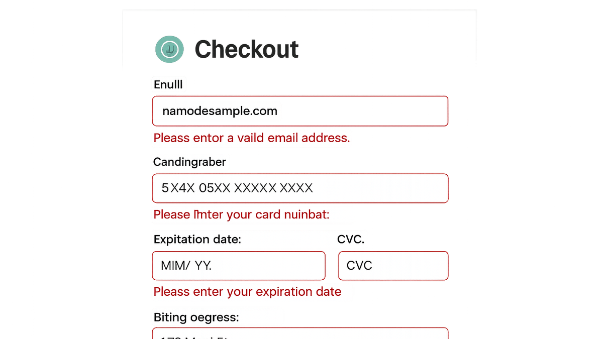
Checkout error messages are notifications displayed during the e-commerce checkout process when a user’s input does not meet validation requirements. These messages serve as real-time guidance, informing shoppers of mistakes—such as invalid credit card numbers, expired coupons, or incorrectly formatted shipping addresses—and how to correct them. Well-designed error messages can significantly reduce cart abandonment, improve conversion rates, and foster user trust. From a CRO perspective, clear and actionable messages minimize friction points and keep potential buyers moving smoothly toward purchase. For UX, they offer an intuitive and empathetic experience, while from an SEO standpoint, they contribute to overall site health by reducing bounce rates and ensuring accessible content for all users. SaaS platforms like Prevue.me can audit and critique your error messaging alongside broader CRO, UX, SEO, and accessibility assessments, delivering actionable feedback to maximize lead generation.
Checkout error messages
Guiding users to correct input errors in the e-commerce checkout, boosting conversions, trust, and accessibility.
Why Checkout Error Messages Matter
Effective checkout error messages play a critical role in optimizing conversions and user satisfaction. They provide immediate, contextual feedback that guides users through the form, minimizes errors, and reduces frustration. By clearly explaining what went wrong and how to fix it, these messages help retain customers who might otherwise abandon their carts. From an SEO perspective, a smoother user journey with fewer abandoned sessions can signal quality to search engines, improving your site’s performance in search results. Accessibility considerations, such as screen-reader-friendly error announcements, ensure that all users benefit from intuitive guidance.
-
Driving conversions and reducing abandonment
Clear error messages help users quickly identify and correct mistakes, resulting in fewer drop-offs and higher completion rates.
- Provide clear guidance:
Explain exactly what is wrong (e.g., “Card number must be 16 digits”).
- Reduce frustration:
Use a friendly tone to keep users engaged rather than frustrated.
- Provide clear guidance:
-
Enhancing user trust and satisfaction
Well-crafted messages convey empathy and expertise, making users feel supported during the checkout process.
- Human tone:
Write messages in a conversational style to foster rapport with users.
- Transparency:
Display validation rules upfront so users know how to format their entries.
- Human tone:
-
Seo and accessibility benefits
Optimized error handling contributes to a better overall site experience, potentially lowering bounce rates and improving search rankings.
- Screen reader announcements:
Use ARIA-live regions to ensure errors are announced to assistive technologies.
- Impact on engagement metrics:
A seamless checkout reduces abandoned sessions and signals quality to search engines.
- Screen reader announcements:
Best Practices for Checkout Error Messages
Implementing best practices ensures your error messages are effective, accessible, and aligned with your brand voice. Consider clarity, placement, consistency, and inclusivity to optimize the checkout flow and avoid common UX pitfalls.
-
Use clear, specific, and actionable language
Avoid vague statements. Tell users exactly what went wrong and how to fix it.
- Field-specific messages:
Associate each message directly with the relevant input field.
- Actionable steps:
Guide users with next steps (e.g., “Enter a date after today’s date”).
- Field-specific messages:
-
Implement inline and real-time validation
Validate inputs as users type to catch errors immediately and prevent form submissions with multiple errors.
- Instant feedback:
Use JavaScript to validate fields on blur or input change.
- Visual cues:
Highlight fields with errors using color and icons.
- Instant feedback:
-
Maintain consistent styling and placement
Keep error messages visually connected to the fields they relate to, using consistent design patterns.
- Visual contrast:
Ensure error text stands out against the background.
- Proximity to fields:
Place messages immediately above or below the input.
- Visual contrast:
-
Ensure accessibility compliance
Follow WCAG guidelines to make error messages available to all users.
- Aria roles and attributes:
Use
aria-invalidandaria-describedbyto link errors to fields. - Keyboard navigation:
Ensure users can navigate to error messages using the keyboard alone.
- Aria roles and attributes:
Common Pitfalls and How to Avoid Them
Awareness of frequent mistakes helps you preemptively address issues that could undermine your checkout experience.
-
Using vague or technical jargon
Messages like “Error 402” confuse users and offer no guidance.
- Avoid error codes:
Use plain language instead of numeric codes.
- Simplify language:
Choose common terms over technical ones (e.g., “expired” vs “invalid”).
- Avoid error codes:
-
Overwhelming users with multiple errors
Flooding users with a long list of errors can be discouraging and hard to digest.
- Prioritize errors:
Show the most critical error first.
- Provide a summary:
Offer a brief overview followed by inline details.
- Prioritize errors:
-
Omitting actionable next steps
Leaving users without instructions on how to correct inputs leads to abandonment.
- Include fix instructions:
Always pair an error with a solution.
- Include fix instructions:
-
Ignoring mobile responsiveness
Tiny error text or misplaced messages can be hard to read on small screens.
- Responsive design:
Ensure error messages adapt to different screen sizes.
- Responsive design:
Examples and Tools
Explore practical code snippets and SaaS platforms that can help you audit and refine your checkout error messages.
-
Html example
<label for=\"email\">Email</label> <input type=\"email\" id=\"email\" aria-describedby=\"email-error\"> <div id=\"email-error\" class=\"error\" role=\"alert\">Please enter a valid email address.</div> -
Prevue.me actionable critiques
Use prevue.me to get in-depth feedback on your error messaging as part of a full CRO, UX, SEO, and accessibility audit, ensuring no friction points are overlooked.
-
Other useful tools
Complement your audits with Hotjar for session recordings, Optimizely for A/B testing, and Lighthouse for accessibility checks.