Published on 2025-06-29T19:44:44Z
What is Color Psychology? Examples for CRO/UX/SEO
Color psychology is the study of how colors influence human emotions and decision-making. On websites, selecting the right hues can improve user engagement, build brand trust, and drive conversions. In the context of Conversion Rate Optimization (CRO), User Experience (UX), and Search Engine Optimization (SEO), color choices directly impact key behavioral metrics—like click-through rates, bounce rates, and dwell time—that determine a site’s success. Tools such as Prevue.me provide actionable critiques on color contrast, accessibility, and overall UX impact, helping teams refine their palette combinations for maximum lead generation.
Color psychology
Color psychology studies how colors influence user emotions and behaviors to improve CRO, UX, and SEO on websites.
Definition and Relevance
An overview of what color psychology means for web design and why it matters for site performance.
-
Understanding color psychology
The study of how colors affect human emotions, perceptions, and decision-making on digital interfaces.
-
Historical context in marketing
Brands have long used color schemes to evoke trust, excitement, or urgency in print and broadcast ad campaigns; modern websites follow the same principles.
-
Impact on cro, ux, and seo
Color choices shape engagement metrics like click-through rate, time on page, and bounce rate, which are critical for conversions and search ranking.
Applying Color Psychology for CRO and UX
Practical techniques to leverage color theory in button designs, layouts, and user flows to boost conversion and satisfaction.
-
Selecting effective ctas
Choose colors that stand out and convey the right emotion for your call-to-action buttons to maximize clicks.
- Contrast ratio:
Ensure CTAs pop against the background—use tools like prevue.me to verify WCAG compliance.
- Emotion evocation:
Red can trigger urgency, blue inspires trust; pick hues aligned with your campaign goal.
- Contrast ratio:
-
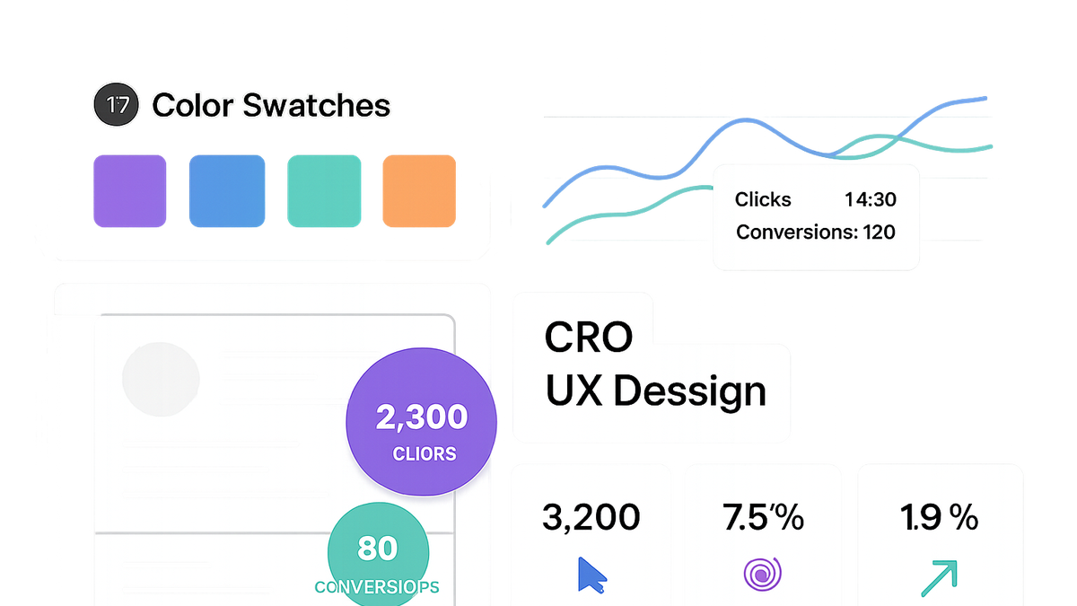
Building cohesive color palettes
Structure your palette into primary, secondary, and accent colors for visual harmony.
- Primary color:
Main brand hue used for headers and key interface elements.
- Secondary color:
Complementary shade that supports the primary color in backgrounds or highlights.
- Accent color:
Used sparingly for buttons, links, or notifications to draw attention.
- Primary color:
-
Accessibility considerations
Make sure all users— including those with visual impairments—can perceive your color choices.
- Contrast ratio tests:
Use prevue.me’s accessibility critiques or contrast checkers to meet WCAG 2.1 AA/AAA standards.
- Color blindness simulation:
Test your site with tools that simulate common color vision deficiencies.
- Contrast ratio tests:
Enhancing SEO with Color-Driven Engagement
How thoughtful color strategies can improve behavioral SEO signals and overall site performance.
-
Reducing bounce rates
Warm, welcoming palettes can encourage visitors to explore deeper, lowering bounce rates.
-
Increasing dwell time
Engaging color contrasts and harmonious layouts keep users on page longer, signaling quality to search engines.
-
Mobile optimization
Adapt color schemes to small screens to maintain readability and visual appeal on all devices.
- Responsive color adjustments:
Ensure your palette scales properly at different resolutions and brightness settings.
- Responsive color adjustments:
Testing and Validation Techniques
Methodologies to empirically validate color choices and measure their impact on user behavior.
-
A/b testing
Run experiments on color variations for buttons or backgrounds using prevue.me and measure conversion lift.
- Hypothesis creation:
Define clear expectations for how a color change will affect your KPI before testing.
- Metric tracking:
Monitor click-through rates, form submissions, and other conversion metrics as your primary indicators.
- Hypothesis creation:
-
Heatmaps and session recordings
Visualize where users click and how they navigate to infer the effectiveness of your color layout.
-
User feedback surveys
Collect qualitative insights on how real users perceive your palette and what emotions it evokes.
Best Practices and Common Pitfalls
Guidelines to maintain effectiveness of your color strategy and avoid frequent mistakes.
-
Maintain brand consistency
Adhere to your established color guidelines to reinforce recognition and trust.
-
Avoid overuse of vibrant colors
Excessive brightness or multiple competing hues can overwhelm and confuse users.
-
Regular audits
Periodically review color performance and accessibility with tools like prevue.me to adapt to evolving user preferences.