Published on 2025-06-29T21:46:27Z
What is Device Targeting? Examples for Device Targeting
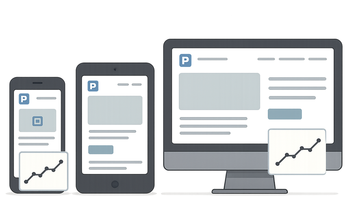
Device targeting (or device-based personalization) refers to tailoring website content, layout, and functionality to the user’s device type—desktop, tablet, or mobile. In CRO, UX, and SEO audits, device targeting plays a crucial role in ensuring that each visitor receives an optimal experience regardless of screen size. By analyzing device-specific metrics, teams can identify layout shifts, performance bottlenecks, and usability issues unique to different devices. SaaS platforms like Prevue.me provide actionable critiques on breakpoints, touch targets, and mobile performance to guide enhancements. Effective device targeting not only improves conversion rates and user satisfaction but also aligns with search engines’ mobile-first indexing policies.
Device targeting
Delivery of optimized website layouts and features based on device type to enhance CRO, UX, and SEO.
Why Device Targeting Matters in CRO, UX, and SEO
Device targeting tailors interfaces to device-specific contexts—desktop, tablet, or mobile—impacting conversion rates, user engagement, and search rankings.
-
Conversion rate optimization (cro)
Delivering device-optimized layouts and calls-to-action reduces friction and increases conversions.
- Reduced friction:
Optimizing forms and buttons for each device minimizes user effort and abandoned sessions.
- Reduced friction:
-
User experience (ux)
Adjusting navigation, typography, and media for different screens enhances satisfaction and usability.
- Tailored layouts:
Device-specific grids and images ensure content remains clear and engaging on all viewports.
- Tailored layouts:
-
Search engine optimization (seo)
Meeting mobile-first indexing guidelines and improving mobile performance boosts search visibility on Google.
- Mobile-first indexing:
Google predominantly uses the mobile version of content for indexing and ranking.
- Mobile-first indexing:
Common Device Targeting Strategies
Websites typically use one of several approaches to deliver device-specific experiences.
-
Responsive design
Uses fluid grids and CSS media queries to automatically adjust layouts across screen sizes.
- Media queries:
Define breakpoints in CSS to change styles at specified viewport widths.
- Media queries:
-
Adaptive design
Serves predefined layouts for distinct device categories based on detected screen size.
- Server-side detection:
Identify the device on the server and deliver the corresponding HTML and CSS bundle.
- Server-side detection:
-
Dynamic serving
Returns different HTML/CSS on the same URL, depending on the user-agent string.
- Vary header:
Include a Vary: User-Agent HTTP header to inform caches of device-specific content.
- Vary header:
Auditing Device Targeting with Prevue.me
prevue.me simplifies the audit process by highlighting device-specific issues and actionable recommendations.
-
Breakpoint evaluation
prevue.me scans your site at common viewport widths and flags layout breakpoints with issues.
- Critical viewports:
Ensure key widths like 320px, 768px, and 1024px render content without overlap or scrolling errors.
- Critical viewports:
-
Mobile ux critique
The tool reviews touch targets, font sizes, navigation patterns, and legibility on smaller screens.
- Touch target size:
Maintain at least 44×44px touch areas to improve tap accuracy on mobile devices.
- Touch target size:
-
Performance & accessibility checks
prevue.me highlights slow-loading resources and accessibility barriers across devices.
- Image optimization:
Compress images and implement responsive formats (WebP, AVIF) to reduce load times.
- Image optimization:
Best Practices and Common Pitfalls
Adhering to these guidelines can help you avoid frequent mistakes and ensure robust device targeting.
-
Test on real devices
Emulators provide a baseline, but physical devices reveal performance and usability nuances.
-
Adopt mobile-first approach
Design for the smallest screens first, then progressively enhance for larger viewports.
-
Monitor analytics by device
Segment user behavior and conversion metrics by device in tools like Google Analytics to identify gaps.
- Device segmentation:
Analyze bounce rates, session durations, and goal completions separately for desktop, tablet, and mobile.
- Device segmentation: