Published on 2025-06-29T19:33:22Z
What is Responsive Design? Examples for Website Optimization
Responsive Design is a fundamental web development approach that ensures your site’s layout and
content automatically adapt to any screen size or orientation. By using flexible grids, media queries, and
scalable images, responsive sites deliver a consistent and optimized experience across desktops, tablets,
and mobile devices. For UX, this means improved readability, navigation, and reduced friction, leading to
higher user satisfaction. SEO stands to benefit as Google favors mobile-friendly, fast-loading pages in
its mobile-first index. In terms of CRO, responsive sites typically see increased engagement, lower bounce
rates, and higher conversion rates as visitors can access and interact with content seamlessly. Tools like
Prevue.me offer actionable critiques, highlighting responsive design issues and providing
recommendations to maximize lead generation, usability, accessibility, and SEO performance. Embracing
responsive design is no longer optional—it’s essential for any modern website aiming to capture and
convert users across diverse devices.
Responsive design
Responsive Design ensures websites adapt across devices, boosting UX, SEO, and conversions through fluid layouts, media queries, and flexible assets.
Why Responsive Design Matters
Responsive design is crucial for ensuring a positive user experience (UX), boosting search engine rankings (SEO), and driving conversions (CRO). With a single codebase, you maintain one site that adapts fluidly rather than separate mobile and desktop versions. This streamlined approach reduces maintenance overhead and avoids content duplication penalties in SEO. By catering to user preferences and device contexts, you minimize friction and build trust. Below are the main reasons responsive design matters in website optimization.
-
Better user experience
A responsive layout ensures users can easily read and navigate content on any device, reducing bounce rates and increasing engagement.
- Consistent layout:
Maintains uniform look and functionality across devices, reinforcing brand identity.
- Optimized touch targets:
Adjusts button sizes and spacing for comfortable tapping on touchscreens.
- Consistent layout:
-
Improved seo rankings
Responsive sites align with Google’s mobile-first indexing, using a single URL to avoid duplicate content and improve crawl efficiency.
- Single url structure:
Consolidates SEO value by avoiding separate mobile URLs.
- Faster loading times:
Optimized assets and adaptive images contribute to quicker page loads on all devices.
- Single url structure:
-
Enhanced conversion rates
Seamless interactions on any screen minimize friction in the user journey, leading to higher form submissions and purchases.
- Reduced friction:
Smooth performance and clear calls to action encourage user actions.
- Higher engagement:
Tailored layouts keep users focused on goals, such as signing up or making a purchase.
- Reduced friction:
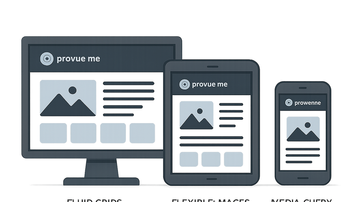
Core Principles and Techniques
Several foundational techniques power responsive design, allowing flexible layouts and scalable assets. Understanding these core principles helps implement responsive interfaces effectively.
-
Fluid grids
Use percentage-based widths instead of fixed pixels to let page elements resize dynamically.
- Percentage-based layouts:
Defines element widths relative to the viewport or container using percentages.
- Column structures:
Organizes content into flexible columns that adapt to screen sizes.
- Percentage-based layouts:
-
Flexible images and media
Images and media elements scale or swap based on screen size to maintain clarity and performance.
- Responsive `srcset`:
Specifies multiple image sources for different resolutions and viewports.
- `max-width: 100%`:
Ensures media elements never exceed their container’s width.
- Responsive `srcset`:
-
Css media queries
Apply styles conditionally based on device characteristics like width, height, or orientation.
- Breakpoint definitions:
Set specific viewport widths to trigger layout changes.
- Orientation queries:
Adjust layouts when devices switch between portrait and landscape modes.
- Breakpoint definitions:
How Prevue.me Enhances Responsive Design
prevue.me is a SaaS platform specializing in website critiques for CRO, UX, SEO, and accessibility. It automates responsive design evaluation, pinpointing layout issues, touch target problems, and performance bottlenecks across devices.
-
Automated layout analysis
prevue.me crawls pages and visualizes how layouts adapt at various breakpoints.
- Off-screen content detection:
Flags elements that extend beyond viewport boundaries.
- Overflowing elements:
Identifies items that cause horizontal scrolling.
- Off-screen content detection:
-
Touch and click target evaluation
Analyzes the size and spacing of interactive elements to ensure they meet accessibility and usability standards.
- Minimum tap areas:
Checks buttons and links against recommended touch target sizes.
- Element spacing:
Ensures enough space between interactive elements to prevent mis-taps.
- Minimum tap areas:
-
Performance and accessibility checks
Audits responsive image handling and ARIA usage to balance load times with inclusive design.
- Responsive image formats:
Recommends modern formats like WebP and proper
srcsetusage. - Aria roles and landmarks:
Verifies accessible navigation and content structure across viewports.
- Responsive image formats:
Best Practices and Common Pitfalls
Adopting a strategic approach to responsive design avoids unnecessary complexity and ensures consistent results. Below are key best practices and pitfalls to avoid.
-
Start with a mobile-first approach
Design for smaller screens first to prioritize essential content and functionality.
-
Regular cross-device testing
Continuously test on real devices and emulators to catch device-specific issues early.
-
Limit breakpoint proliferation
Use only necessary breakpoints to maintain manageable CSS and avoid style conflicts.