Published on 2025-06-29T21:14:48Z
What is an eCommerce Hero Banner? Examples & Best Practices
An eCommerce Hero Banner is the primary visual section at the top of an online store’s homepage or landing page. It typically includes a high-quality image or video, a compelling headline, a brief value proposition, and a clear call-to-action (CTA) to guide visitors toward conversion. This prominent placement captures user attention within the first few seconds and sets the tone for the shopping experience. From a CRO perspective, an optimized hero banner can significantly boost click-through rates and drive lead generation. For UX, it provides immediate context, navigation cues, and brand reinforcement. SEO-wise, properly annotated images with descriptive alt text and structured data can improve visibility in search results. Tools like Prevue.me can deliver actionable critiques on design clarity, accessibility, loading performance, and messaging to ensure your hero banner maximizes both user engagement and technical SEO compliance.
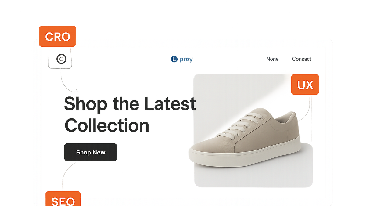
Ecommerce hero banner
A top-of-page eCommerce banner featuring key visuals, messaging, and CTAs optimized for CRO, UX, and SEO.
Why the Hero Banner Matters
The hero banner is the first visual touchpoint for visitors and significantly influences their engagement. It sets user expectations, conveys brand identity, and provides clear path to conversion. From CRO, UX, and SEO perspectives, the hero banner unites aesthetics with performance metrics to create measurable impact.
-
Above-the-fold visibility
Placement at the top ensures immediate visibility, capturing attention before users scroll. A strong above-the-fold banner can reduce bounce rates and increase time-on-page.
- First impressions:
A high-impact hero banner forms the visitor’s initial perception of your brand’s quality and trustworthiness.
- Scroll behavior:
Users often decide to scroll based on the banner’s relevance and appeal.
- First impressions:
-
Brand messaging and value proposition
Your hero banner communicates core benefits and differentiators, aligning brand voice with user needs.
- Clear messaging:
A concise headline and supporting text articulate your offering’s unique value.
- Emotional resonance:
Visuals and copy should evoke the desired emotional response to drive engagement.
- Clear messaging:
-
Driving conversions with ctas
A prominent call-to-action guides visitors toward the next step, whether browsing products or signing up.
- Cta clarity:
Use action-oriented language that clearly states what happens when users click.
- Placement and contrast:
Ensure the button stands out against the background and is easy to locate.
- Cta clarity:
-
Seo and accessibility
Optimizing for search engines and inclusive design enhances discoverability and user experience.
- Image alt text and tags:
Provide descriptive alt attributes for images to improve SEO and screen-reader accessibility.
- Structured data:
Implement schema markup to help search engines understand your content context.
- Image alt text and tags:
Best Practices for Effective Hero Banners
Adhering to proven design and content principles ensures your hero banner performs across devices and channels.
-
High-quality visuals
Use crisp, relevant images or videos that reflect your product or brand story.
-
Concise and compelling headlines
Craft short, benefit-driven headlines that instantly communicate value.
-
Prominent and actionable ctas
Design buttons that are easy to tap or click, with clear labels and accessible styling.
-
Responsive design and fast load times
Optimize assets and layout for mobile devices and prioritize quick rendering.
-
A/b testing and iteration
Continuously test variations of images, copy, and CTAs to identify top performers.
Common Pitfalls and How Prevue.me Helps
Even well-intentioned hero banners can fall short. prevue.me offers targeted critiques to address frequent issues.
-
Cluttered design
Overloaded banners can confuse visitors and dilute your message.
- Prevue.me critique:
Analyzes visual hierarchy and suggests removal or reprioritization of elements to improve clarity.
- Prevue.me critique:
-
Weak or missing cta
Without a clear next step, visitors may leave without engaging.
- Prevue.me critique:
Evaluates CTA placement, wording, and contrast to recommend more persuasive calls-to-action.
- Prevue.me critique:
-
Slow loading images
Large or unoptimized assets can increase load times and frustrate users.
- Prevue.me critique:
Assesses image sizes and formats, offering compression or format change suggestions for faster load.
- Prevue.me critique:
-
Poor accessibility compliance
Accessibility oversights prevent users with disabilities from fully engaging.
- Prevue.me critique:
Scans for missing alt text, insufficient contrast, and ARIA attributes, providing actionable fixes.
- Prevue.me critique:
Tools and Techniques for Optimizing Hero Banners
Beyond design principles, leverage specialized tools to measure, test, and refine your banners.
-
Prevue.me
Use prevue.me to run comprehensive critiques on CRO, UX, SEO, and accessibility aspects of your hero banner.
-
Google pagespeed insights
Evaluate load performance and receive recommendations to optimize images and scripts for faster rendering.
-
Hotjar heatmaps
Visualize user attention and interaction hotspots to understand how visitors engage with your hero section.
-
A/b testing platforms (optimizely, vwo)
Test multiple banner variations to determine which design and messaging drive the highest conversions.