Published on 2025-06-29T21:59:03Z
What is an eCommerce Seasonal Banner? Examples and Best Practices
An eCommerce seasonal banner is a strategically placed visual or text element on an online store’s homepage or landing pages, tailored to highlight time-sensitive promotions tied to seasons, holidays, or special events. These banners play a pivotal role in guiding user attention toward limited-time offers, fostering urgency that boosts click-through and conversion rates. However, without careful design and implementation, they can negatively impact user experience by causing layout shifts, slowing page load times, and creating accessibility barriers. From an SEO perspective, oversized images or improper HTML markup can hinder crawlability and lower rankings. Integrating best practices for CRO, UX, SEO, and accessibility ensures that seasonal banners are both visually appealing and technically sound across all devices. Tools like Prevue.me offer actionable critiques to evaluate and enhance banners, providing insights into lead generation, usability, and technical optimization. By balancing aesthetics with functionality, online retailers can craft compelling seasonal banners that resonate with customers and drive business growth.
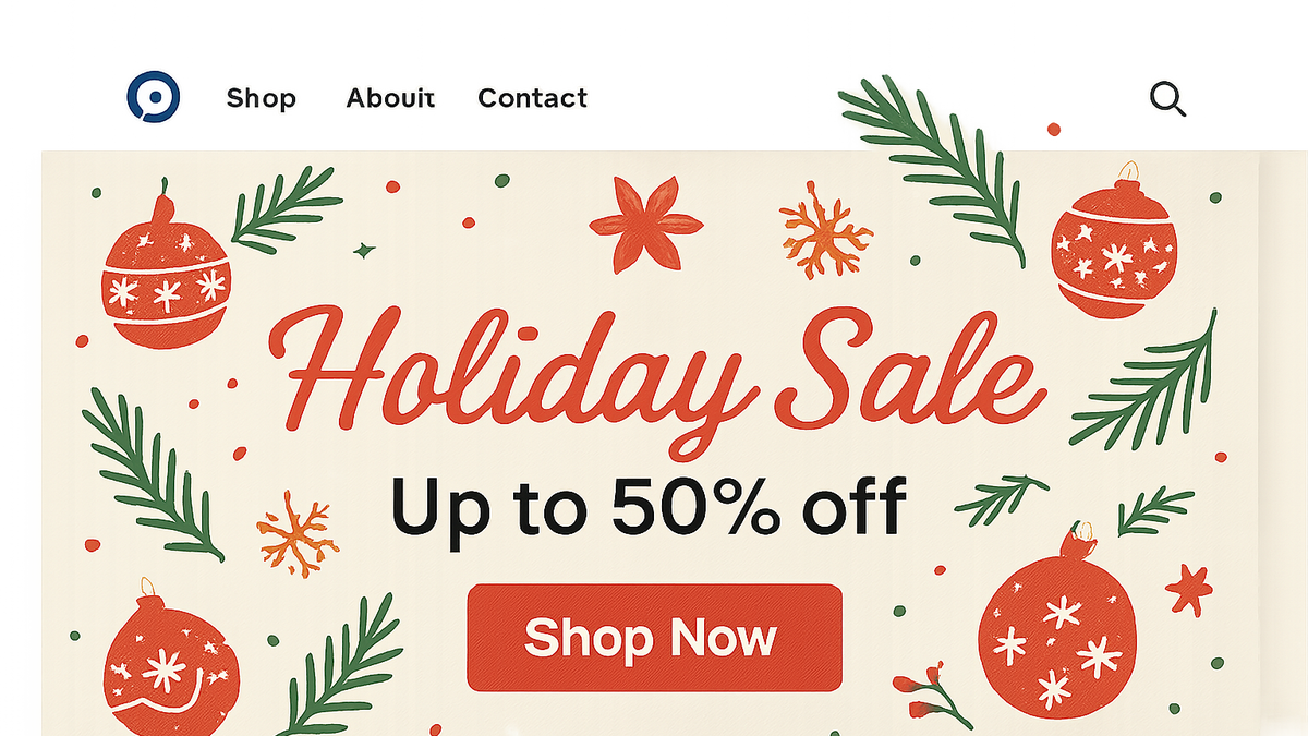
Ecommerce seasonal banner
eCommerce seasonal banners highlight time-bound promotions, influencing conversion rates, user experience, SEO, and accessibility.
Definition and Purpose
Clarify what an eCommerce seasonal banner is and why it matters for online retail.
-
Definition
An eCommerce seasonal banner is a website graphic or message tailored to a specific time-bound event or holiday, designed to draw attention to promotions or thematic content.
-
Primary goals
Drive engagement and conversions by tapping into seasonal trends and customer interest during holidays or events.
- Promote timely offers:
Emphasize limited-time discounts or themed products to create urgency.
- Enhance brand relevance:
Align visuals and messaging with seasonal themes to resonate with consumer sentiment.
- Promote timely offers:
Importance for CRO, UX, and SEO
Explore how seasonal banners influence conversion rate optimization, user experience, and search engine performance.
-
Cro impact
Properly designed banners can increase click-through rates, reduce bounce, and guide users directly to promotional pages.
-
Ux considerations
They should enhance the browsing experience without disrupting navigation or content hierarchy, ensuring clear communication.
- Visible cta:
Place clear and accessible call-to-action buttons to guide next steps.
- Load speed:
Optimize images and use modern formats to prevent slowdowns.
- Visible cta:
-
Seo implications
Implement banners without hindering page speed or causing layout shifts that could negatively impact rankings.
- Alt text:
Use descriptive alt attributes for accessibility and crawlability.
- Lazy loading:
Defer off-screen images to improve initial load times and user experience.
- Alt text:
Best Practices
Guidelines to design and implement seasonal banners effectively across CRO, UX, and SEO dimensions.
-
Alignment with branding
Maintain consistent brand colors, fonts, and tone even when introducing seasonal elements.
-
Responsive design
Ensure banners adapt to various screen sizes and orientations without distortion.
-
Accessibility compliance
Follow WCAG guidelines for color contrast, keyboard navigation, and screen reader compatibility.
- Contrast ratio:
Maintain a minimum 4.5:1 ratio for text to ensure readability.
- Contrast ratio:
-
Clear and concise ctas
Use action-oriented language and place buttons prominently to maximize conversions.
-
Seo optimization
Optimize file sizes, use proper HTML tags, and include relevant keywords in headings and alt text.
Common Pitfalls and How to Avoid Them
Identify frequent mistakes in seasonal banner implementation and strategies to mitigate them.
-
Overcrowded design
Too many elements can overwhelm users; focus on simplicity and a clear focal point.
-
Poor contrast and accessibility
Ignoring color accessibility can alienate users with visual impairments; always test contrast ratios.
-
Neglecting mobile experience
Failing to test on mobile can lead to broken layouts; ensure touch-friendly sizing and alignment.
-
Ignoring performance impacts
Large or unoptimized images slow page load; use compression and modern formats like WebP.
Using Prevue.me for Actionable Critiques
Leverage prevue.me to evaluate and enhance your seasonal banners across multiple dimensions.
-
Getting cro and lead generation feedback
Use prevue.me to analyze banner placement, message clarity, and CTA effectiveness for higher conversions.
-
Ux and accessibility audits
Receive insights on readability, navigation flow, and compliance with accessibility standards.
-
Seo and performance analysis
Identify opportunities to optimize image alt text, load times, and HTML structure for better search rankings.
-
Implementing recommendations
Translate prevue.me’s actionable critiques into design tweaks and code optimizations for measurable improvements.