Published on 2025-06-29T21:51:25Z
What is Error Messaging? Examples for CRO, UX & SEO
Error messaging refers to the practice of providing clear, contextual feedback to users when an input validation fails or when a system error occurs. In web design, this includes UI elements such as inline hints, banner alerts, or modal dialogs that inform users of what went wrong and how to correct it. Effective error messages reduce user frustration, prevent form abandonment, and guide visitors smoothly through interactions. They are a fundamental aspect of optimizing user experience (UX), conversion rate optimization (CRO), and maintaining accessibility and SEO compliance.
Error messaging
Clear, contextual error messages improve user experience, conversion rates, accessibility, and SEO performance.
What is Error Messaging?
Error messaging refers to the practice of providing clear, contextual feedback to users when an input validation fails or when a system error occurs. In web design, this includes UI elements such as inline hints, banner alerts, or modal dialogs that inform users of what went wrong and how to correct it. Effective error messages reduce user frustration, prevent form abandonment, and guide visitors smoothly through interactions. They are a fundamental aspect of optimizing user experience (UX), conversion rate optimization (CRO), and maintaining accessibility and SEO compliance.
-
Definition and function
Error messages are notifications displayed within an interface to inform users of invalid inputs or errors. They communicate what went wrong and suggest corrective actions, preventing confusion and drop-offs.
-
Types of error messaging
Error messages can be delivered through different UI patterns, each suited to particular use cases.
- Inline error messages:
Appears adjacent to the form field with the error. Offers immediate context and reduces user effort to locate the problem.
- Global error messages:
Displayed at the top of a form or page, listing all errors after form submission. Useful for long forms or when multiple fields error.
- Toast notifications:
Temporary alerts that appear briefly in a corner of the screen. Good for non-critical errors or system notifications.
- Inline error messages:
Why Error Messaging Matters for CRO, UX, and SEO
Effective error messaging is essential for optimizing conversion rates, enhancing user experience, ensuring accessibility, and maintaining SEO best practices. By guiding users through errors with clarity and empathy, you reduce friction in your conversion funnels, support all users through accessible design, and preserve search engine crawlers’ ability to navigate and index your site.
-
Impact on conversion rate
Clear, actionable error messages reduce form abandonment and friction in the conversion funnel, leading to higher submission rates.
- Form drop-off analysis:
Use analytics tools to track where users abandon forms and address unclear or missing error feedback.
- Form drop-off analysis:
-
User experience and accessibility
Accessible error messages ensure all users, including those with disabilities, can understand and resolve input errors, improving satisfaction and compliance with WCAG.
- Aria roles and attributes:
Implement ARIA-live regions and aria-describedBy to announce errors to screen readers.
- Aria roles and attributes:
-
Seo considerations
Proper server response codes and custom 404 pages maintain crawl efficiency and preserve link equity.
- Custom 404 pages:
Design SEO-friendly 404 pages that guide users back to functional content while retaining a 404 status code.
- Custom 404 pages:
Best Practices for Effective Error Messaging
Follow these guidelines to craft error messages that are clear, helpful, and accessible across devices and user groups.
-
Use clear, user-focused language
Write messages in plain, concise language that specifies the error and suggests solutions without jargon.
- Positive tone:
Frame messages constructively, e.g., “Please enter a valid email” instead of “Invalid email.”
- Positive tone:
-
Provide instant, contextual feedback
Validate inputs on blur or in real-time to catch errors early and minimize form resubmissions.
- Real-time validation:
Check inputs as users type, balancing performance to avoid delays or interruptions.
- Real-time validation:
-
Ensure visual and technical accessibility
Use color contrast, icons, and ARIA attributes so error messages are perceivable and announced by assistive technologies.
- Color and icons:
Use error icons and ensure color contrast meets WCAG 2.1 AA standards.
- Color and icons:
Examples and Tools
Concrete examples illustrate proper error messaging, and tools help audit and optimize your implementation.
-
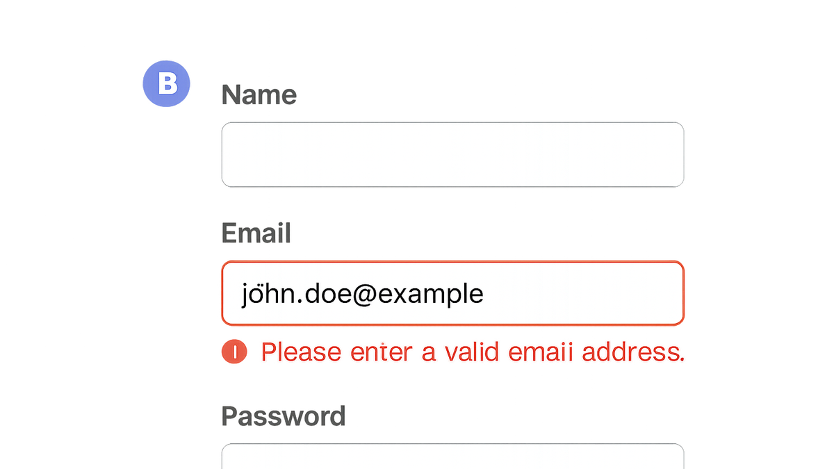
Example: inline form error
<label for=\"email\">Email</label> <input id=\"email\" type=\"email\" aria-describedby=\"email-error\"> <span id=\"email-error\" role=\"alert\" class=\"error\">Please enter a valid email address.</span> -
Tool spotlight: prevue.me
prevue.me provides actionable critiques for error messaging as part of its CRO, UX, SEO, and accessibility analysis. It highlights missing or unclear messages and ranks improvements by impact on lead generation.
- How to use prevue.me:
Submit your webpage URL to receive a prioritized list of error messaging issues and inline suggestions.
- Key features:
Automated detection of missing ARIA attributes, color contrast issues, unclear wording, and poor placement.
- How to use prevue.me:
Common Pitfalls to Avoid
Avoid these common mistakes when designing error messaging to maintain user trust and conversion efficiency.
-
Generic or unhelpful text
Messages like “Error 400” or “Invalid input” don’t guide users on how to fix errors.
-
Delayed error notifications
Waiting until form submission to show errors increases user frustration and drop-offs.
-
Ignoring accessibility
Not using ARIA-live regions or poor color contrast makes errors invisible to some users.