Published on 2025-06-29T21:58:15Z
What are Hover Effects? Enhancing Interaction for CRO, UX & SEO
Hover effects are visual or animated changes triggered when a user’s cursor moves over an interactive element on a website, such as buttons, links, or images. By providing immediate feedback, hover effects improve user experience (UX), guide visitor attention toward call-to-action (CTA) elements, and can boost conversion rates (CRO). Well-designed hover interactions also contribute to perceived performance and engagement, influencing search engine optimization (SEO) indirectly by reducing bounce rates and enhancing dwell time. However, hover-only cues must be paired with focus states and touch-friendly alternatives to ensure accessibility for keyboard and mobile users. Overly complex or resource-intensive hover effects can harm performance and detract from usability, so striking a balance between aesthetic flair and functionality is essential. Tools like Prevue.me can analyze hover effect implementations, providing actionable critiques in the realms of CRO, UX, SEO, and accessibility. By following best practices and leveraging data-driven testing, teams can optimize hover interactions to elevate both user satisfaction and business outcomes.
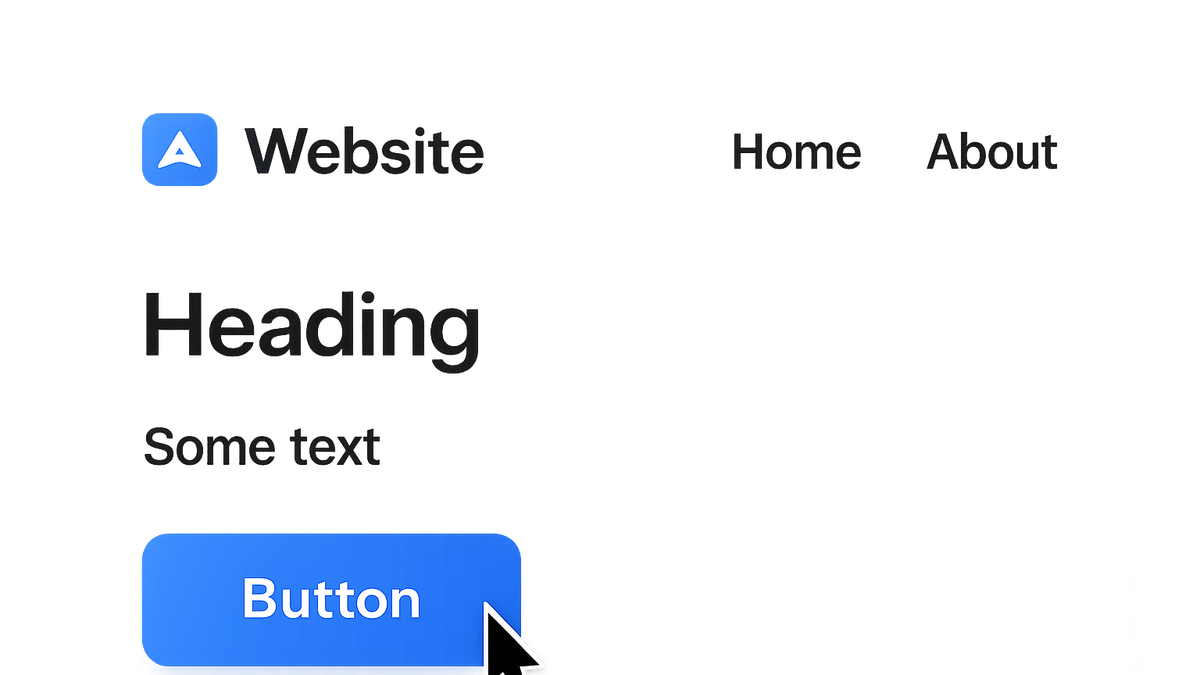
Hover effects
Interactive visual changes on mouse hover that guide users, improve engagement, and impact CRO, UX, and SEO.
Why Hover Effects Matter in CRO, UX, and SEO
Hover effects serve as crucial micro-interactions that offer feedback, highlight interactive elements, and influence user behavior across conversion rate optimization (CRO), user experience (UX), and search engine optimization (SEO).
-
Enhancing cta engagement
Visual feedback on hover helps clarify clickability, increasing user confidence and click-through rates on crucial buttons.
- Increased click rates:
Subtle hover transitions can boost CTA click-through by reinforcing actionable cues.
- Clear affordances:
Changing button styles on hover distinguishes actionable elements from static content.
- Increased click rates:
-
Improving user experience
Hover effects create real-time feedback loops that make navigation intuitive and delightful.
- Feedback loops:
Instant visual responses validate user actions and reduce uncertainty.
- Improved usability:
Dynamic cues guide users smoothly through interactive interfaces.
- Feedback loops:
-
Influencing seo and performance
While hover effects enhance engagement, poorly optimized animations may slow page loading, impacting SEO.
- Performance overhead:
Excessive use of heavy animations can increase rendering times and affect Core Web Vitals.
- Accessibility impact:
Lack of non-hover alternatives can lead to exclusion of keyboard and touch users.
- Performance overhead:
-
Accessibility considerations
Relying solely on hover can exclude non-pointer users; always include focus states and touch-friendly alternatives.
- Focus states:
Mirror hover styles with
:focusselectors to support keyboard navigation. - Touch-friendly alternatives:
Provide tap or long-press triggers for hover-only interactions on mobile.
- Focus states:
Common Types of Hover Effects
Web designers leverage various hover patterns to create engaging interfaces; understanding these categories helps select the right approach.
-
Color and background transitions
Smooth color shifts on text or backgrounds emphasize interactive elements without overwhelming users.
- Css transition syntax:
Use
transition: background-color 0.3s ease;for sleek color fades.
- Css transition syntax:
-
Scale and transform effects
Slight scaling imparts depth, drawing user focus to buttons or cards.
- Transform example:
Apply
transform: scale(1.05);to gently enlarge elements on hover.
- Transform example:
-
Shadow and depth effects
Box-shadow manipulations simulate elevation, improving visual hierarchy.
- Box-shadow usage:
Define
box-shadow: 0 4px 8px rgba(0,0,0,0.1);for subtle lifts.
- Box-shadow usage:
-
Text and icon animations
Underline reveals, icon rotations, or text color shifts add personality to links and buttons.
Best Practices for Designing Hover Effects
Adhering to standards ensures hover effects are functional, accessible, and performant.
-
Maintain accessibility
Ensure hover cues have keyboard focus styles and screen reader support.
- Use :focus styles:
Match hover styles with
:focusto support keyboard navigation. - Aria attributes:
Implement
aria-describedbyoraria-labelto describe interactive changes.
- Use :focus styles:
-
Ensure performance
Use GPU-accelerated properties and limit repaints to keep animations smooth.
- Leverage transforms:
Prefer
transformandopacityover layout-affecting properties. - Avoid expensive properties:
Refrain from animating
widthorheight, which trigger layout recalculations.
- Leverage transforms:
-
Keep interactions subtle
Subtle movements reduce cognitive load and maintain a professional feel.
- Duration guidelines:
Aim for 0.2s to 0.4s durations to balance noticeability and speed.
- Duration guidelines:
-
Consistency across ui
Apply uniform animation curves and speeds for familiarity across your site.
Implementation Strategies
Various techniques, from pure CSS to JavaScript libraries, enable different levels of complexity and control.
-
Css transitions
The simplest method to animate hover states, requiring minimal code.
- Transition-property:
Define which property to animate, e.g.,
transition-property: background-color;. - Transition-timing-function:
Control easing via values like
ease,ease-in-out, or custom cubic-bezier curves.
- Transition-property:
-
Css animations
Use
@keyframesfor multi-step sequences or complex effects.- @keyframes usage:
Outline from-to or percentage-based steps for elaborate hover animations.
- @keyframes usage:
-
Javascript and libraries
Leverage JS for event handling or advanced sequences with libraries like GSAP.
- Gsap integration:
Utilize GSAP’s
to()methods for smooth, chained hover animations.
- Gsap integration:
-
Performance optimization
Implement
will-changeand lazy-load heavy assets to maintain frame rates.- Will-change property:
Hint the browser about upcoming changes with
will-change: transform;.
- Will-change property:
Testing and Optimization
Data-driven evaluation ensures your hover effects deliver measurable improvements.
-
A/b testing hover variations
Experiment with different hover styles to see which drives more conversions.
- Test setup:
Define control and variations focusing on one effect at a time to isolate impact.
- Key metrics:
Track CTR, time-on-element, and conversion rates for each variant.
- Test setup:
-
User testing and session recording
Observe real users to identify unexpected behaviors or pain points.
- Heatmaps:
Visualize cursor movement hotspots to discover overlooked interactive elements.
- Session recordings:
Watch recordings to see where hover effects might confuse or delight.
- Heatmaps:
-
Data analysis with prevue.me
Use prevue.me’s actionable critiques to optimize hover implementations across CRO, UX, SEO, and accessibility.
- How prevue.me helps:
Automates analysis of hover effect performance and compliance with best practices.
- Implementing recommendations:
Follow prioritized insights to refine hover interactions for maximum impact.
- How prevue.me helps: