Published on 2025-06-29T19:07:01Z
What is Mobile-First Design? Examples and Best Practices for CRO, UX, and SEO
Mobile-First Design is a strategic approach that prioritizes designing for mobile devices before scaling up to tablet and desktop screens. By starting with the smallest screen, designers ensure content clarity, faster load times, and intuitive navigation for the majority of web users. This approach contrasts with legacy desktop-first methods, where features and layouts are shoehorned into smaller formats after the fact. Mobile-First shapes the entire user experience, directly impacting Conversion Rate Optimization (CRO), search rankings, and overall accessibility. Platforms like Prevue.me streamline this process by delivering automated mobile audits, actionable UX recommendations, and SEO insights tailored for handheld devices. Embracing Mobile-First not only future-proofs websites but also maximizes lead generation and user satisfaction across all devices.
Mobile-first design
A design strategy that builds for mobile devices first, enhancing UX, SEO, and CRO before scaling to larger screens.
Why Mobile-First Design Matters
Smartphones account for over half of global web traffic, making mobile-optimized interfaces critical for engagement. Designing from the ground up for small screens ensures faster load times, clearer content hierarchy, and intuitive interactions. This approach directly influences SEO rankings, conversion rates, and accessibility compliance.
-
Meeting user expectations
Users expect fast, seamless experiences on mobile. Mobile-First ensures designs match these expectations, reducing bounce rates.
-
Seo performance
Google’s indexing favors mobile-friendly sites. A Mobile-First approach improves site speed and structure, boosting search visibility.
-
Enhanced cro
Simplified layouts and prioritized content guide users toward key actions, increasing form submissions and purchases.
-
Accessibility & compliance
Starting small makes it easier to implement accessible features like legible fonts, adequate contrast, and touch-friendly controls.
Core Principles of Mobile-First Design
At its core, Mobile-First Design revolves around optimizing content flow, performance, and interactivity for small screens.
-
Content prioritization
Decide what content is essential and present it prominently. Use concise headings and progressive disclosure to streamline information.
- Above the fold:
Place critical elements—like headlines, CTAs, and key imagery—where they are immediately visible without scrolling.
- Simplified navigation:
Use hamburger menus or bottom navigation to save screen space while keeping options accessible.
- Above the fold:
-
Progressive enhancement
Begin with a core experience that works on all mobile browsers, then layer on advanced features for capable devices.
-
Touch-friendly interactions
Design buttons and links with adequate size and spacing to accommodate finger taps, reducing misclicks.
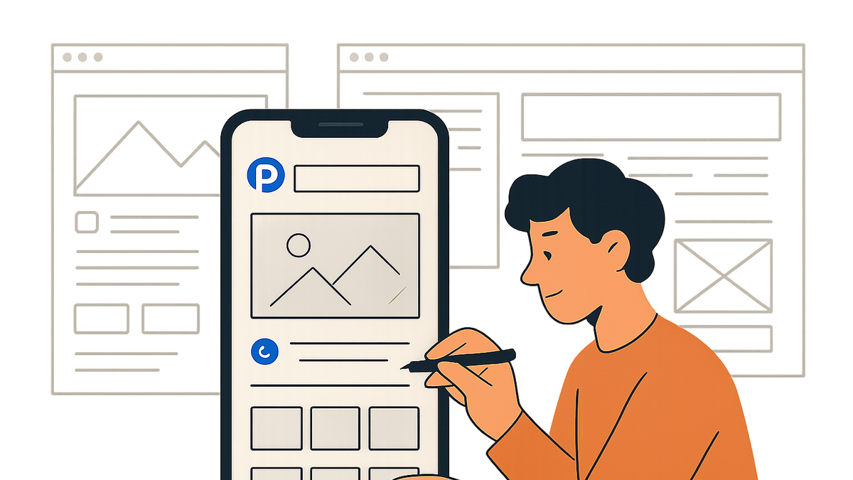
Implementing Mobile-First with Prevue.me
prevue.me offers specialized audits and actionable recommendations to streamline your Mobile-First workflow.
-
Automated mobile audits
prevue.me analyzes your site’s mobile performance, identifying issues in load speed, meta viewport settings, and render-blocking resources.
- Viewport configuration:
Checks for
<meta name="viewport" content="width=device-width, initial-scale=1.0">to ensure proper scaling.
- Viewport configuration:
-
Ui & ux optimization
Receive prioritized suggestions on layout adjustments, tap target sizing, and content hierarchy to boost usability.
- Layout recommendations:
Guidance on collapsing menus, fluid grids, and touch-friendly CTA placement.
- Typography & legibility:
Advice on font sizes, line spacing, and color contrast for readability.
- Layout recommendations:
-
Seo & accessibility insights
Get targeted feedback on mobile SEO elements like structured data, mobile-only redirects, and accessibility compliance.
- Structured data:
Ensures schema markup is correctly implemented for mobile SERPs.
- Wcag checks:
Highlights contrast issues and missing alt text on mobile views.
- Structured data:
Best Practices and Common Pitfalls
Adopting Mobile-First can transform experiences when applied correctly. Watch out for these best practices and pitfalls.
-
Optimize media assets
Use responsive images (
srcset), SVGs, and modern formats like WebP to reduce load times. -
Minimize third-party scripts
Limit external scripts and trackers that can slow mobile performance and trigger layout shifts.
-
Test across devices
Regularly test on real devices and emulators to catch touch issues, performance bottlenecks, and rendering bugs.