Published on 2025-06-29T21:31:55Z
What is an Order Confirmation Page? Examples and Optimization Strategies
The Order Confirmation Page is the web page users see immediately after completing a purchase. It confirms the order details, thanks the customer, and can serve as a powerful conversion and retention tool. Beyond simply acknowledging the sale, it offers opportunities for upselling, cross-selling, and encouraging newsletter subscriptions. A well-optimized confirmation page reinforces brand trust, reduces customer anxiety, and can even contribute to SEO through proper structured data markup. Tools like Prevue.me can analyze confirmation pages for CRO, UX, SEO, and accessibility improvements, providing actionable critiques to maximize lead generation and retention.
Order confirmation page
The post-purchase page that confirms customer orders, builds trust, and drives additional conversions through upsells and CTAs.
Why the Order Confirmation Page Matters
The confirmation page is more than a transactional endpoint—it’s a strategic touchpoint. It reassures customers their order went through successfully and can reduce post-purchase anxiety. It also presents an opportunity to drive additional conversions and collect valuable customer data. Optimizing this stage can enhance brand perception and boost lifetime customer value.
-
Building trust
A clear, accurate confirmation message reassures customers and reduces support inquiries.
-
Enhancing customer experience
Personalized messages and estimated delivery times create a more engaging post-purchase experience.
-
Encouraging additional actions
Use CTAs to promote upsells, cross-sells, or newsletter signups, turning a simple confirmation into a marketing opportunity.
- Upsells and cross-sells:
Recommend complementary products based on the customer’s purchase history.
- Referral invitations:
Invite customers to refer friends for discounts to expand your customer base.
- Upsells and cross-sells:
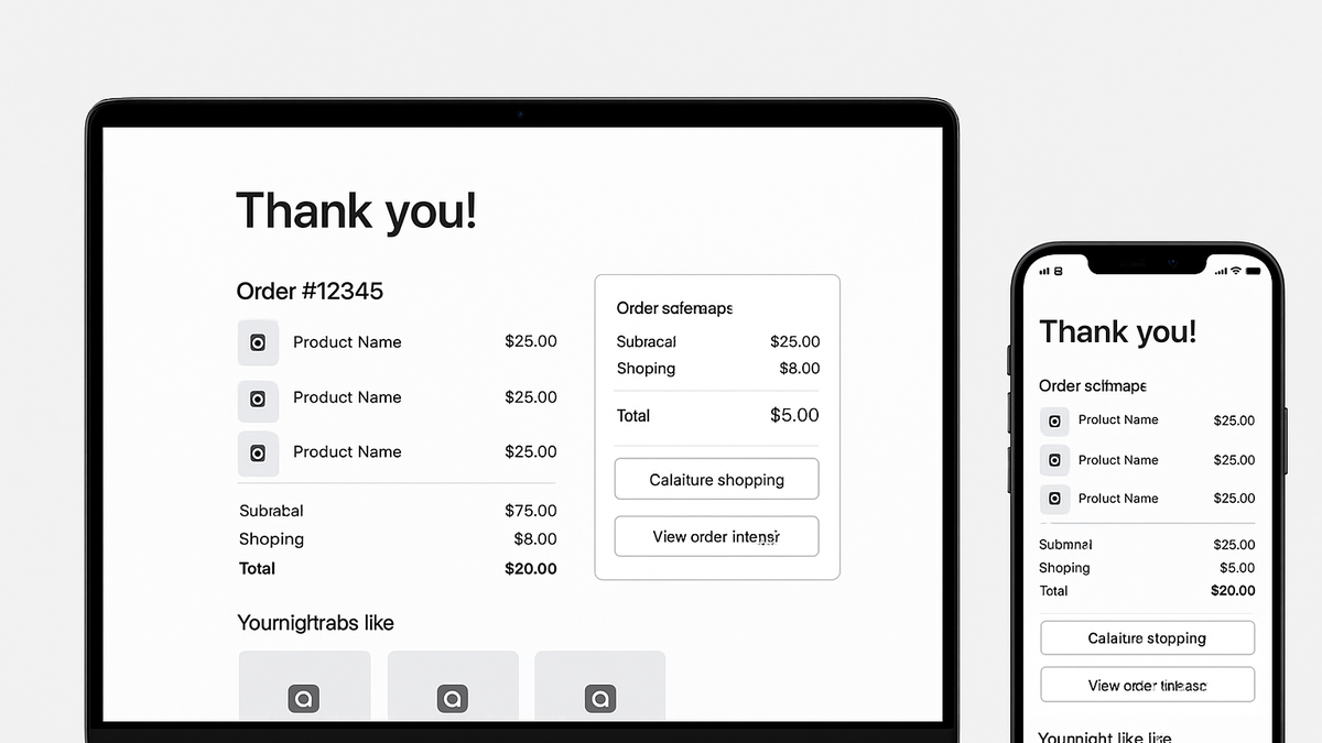
Essential Components of an Order Confirmation Page
Several key elements ensure the confirmation page meets both user and business goals. Customers expect clear order summaries, precise delivery information, and easy access to support. Including trust signals and structured data markup can also boost SEO performance. Finally, prominent next-step CTAs guide users toward additional engagement.
-
Clear confirmation message
Display a prominent thank-you header and order number so customers know their transaction was successful.
-
Order summary and delivery details
List purchased items, prices, shipping costs, and estimated delivery dates to set clear expectations.
-
Support and contact information
Provide accessible links to customer service, FAQs, and live chat to address any post-order questions.
-
Trust signals
Add security badges, real-time inventory updates, and customer reviews to strengthen credibility.
- Security badges:
Show SSL and payment processor logos to reassure users.
- Customer reviews:
Display ratings and testimonials relevant to the purchased product.
- Security badges:
Common Mistakes to Avoid
Errors on a confirmation page can undermine customer trust and miss conversion opportunities. Avoid ambiguous messaging or cluttered layouts that confuse users. Neglecting mobile optimization or accessibility standards can lead to poor user experiences. Similarly, skipping SEO best practices like structured data can mean lost visibility in search features.
-
Ambiguous messaging
Vague or generic confirmation messages leave customers uncertain about order status.
-
Missing next-step ctas
Failing to provide clear CTAs for related actions reduces chances for additional conversions.
-
Poor mobile responsiveness
Ignoring responsive design can frustrate mobile users and increase bounce rates.
-
Neglecting accessibility
Lack of proper HTML semantics, alt text, and keyboard navigation can exclude users with disabilities.
-
Skipping structured data
Without proper schema markup, search engines can’t surface rich snippets like order confirmations.
Optimization Strategies with Prevue.me
prevue.me provides automated critiques and recommendations tailored to your order confirmation page. It blends CRO, UX, SEO, and accessibility audits into a single platform. By analyzing copy clarity, CTA prominence, structured data, and color contrast, prevue.me highlights both strengths and areas for improvement. Actionable insights help you implement high-impact changes quickly.
-
Actionable cro insights
Receive data-driven suggestions for improving CTA placement, button design, and conversion paths.
-
Seo and structured data recommendations
Ensure your page uses correct schema markup and metadata to enhance search visibility and rich results.
-
Ux and accessibility audits
Identify usability issues like poor color contrast or missing ARIA attributes to make your page inclusive.
- Color contrast checks:
Highlights text and background pairs that fail WCAG contrast ratios.
- Keyboard navigation analysis:
Ensures all interactive elements are reachable via keyboard for accessibility.
- Color contrast checks:
Real-World Examples
Learning from successful confirmation page designs can inspire your own optimizations. Below are two examples showing best practices in action. First, a standard e-commerce confirmation page with upsells and clear summary. Second, a SaaS subscription flow highlighting onboarding CTAs. Compare these to your current design and see where prevue.me can add value.
-
E-commerce example
Amazon’s confirmation page features a clean order summary, estimated delivery date, and ‘Buy it again’ options for quick repeat purchases.
-
Saas subscription example
Netflix displays an easy-to-follow ‘Start Watching’ CTA along with account management links and referral offers.