Published on 2025-06-29T20:18:58Z
What is Plan Selection UX? Importance and Best Practices
Plan Selection UX refers to the design and optimization of the interface where users choose between different pricing plans or subscription tiers on a website. It focuses on guiding visitors through the decision-making process by presenting options clearly, highlighting key features, and reducing friction. Effective plan selection UX can significantly improve conversion rates, reduce churn, and foster trust by aligning user expectations with actual offerings. By optimizing every element—from layout and copy to calls-to-action and accessibility—businesses can create seamless experiences that cater to diverse user needs. In the context of Conversion Rate Optimization (CRO), User Experience (UX), and Search Engine Optimization (SEO), thoughtful plan selection design not only drives sign-ups but also enhances search visibility and user satisfaction. This article delves into why plan selection UX matters and offers best practices for creating compelling, high-converting pricing interfaces.
Plan selection ux
Design and optimize pricing or subscription pages to guide user choices, boost conversions, and enhance SEO and accessibility.
Why Plan Selection UX Matters
A well-crafted plan selection interface not only persuades users to convert but also signals clarity and trustworthiness, which can improve SEO metrics like bounce rate and dwell time.
-
Boosting conversion rates
Clear and intuitive plan selection layouts reduce friction and indecision, leading to higher sign-ups and purchases.
- Streamlined decision flow:
Minimize steps between plan introduction and checkout to prevent drop-offs.
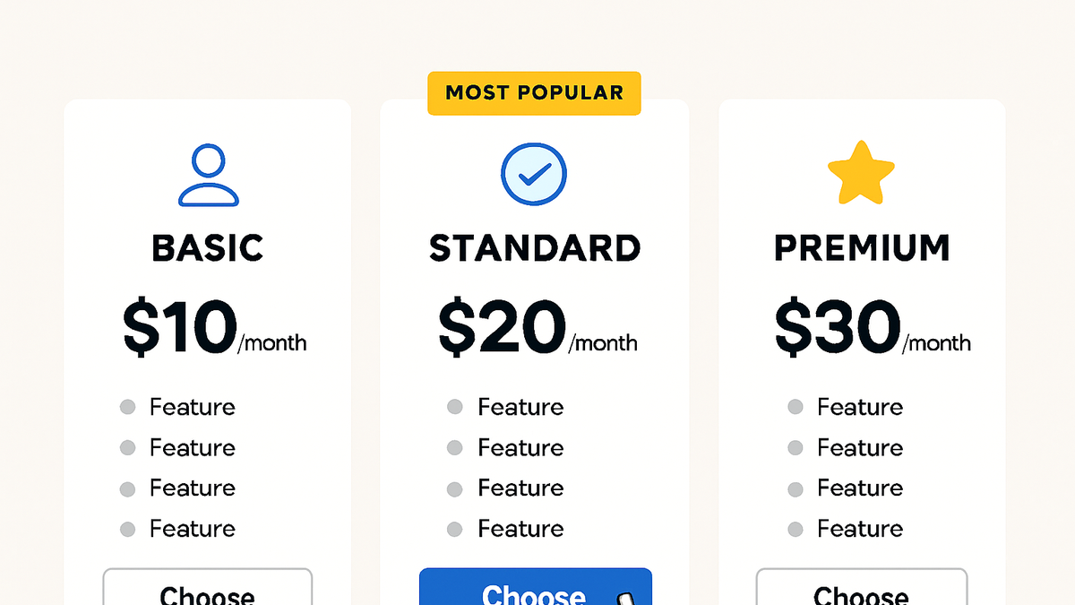
- Highlighted popular plans:
Use badges or default selections to guide users toward high-value options.
- Streamlined decision flow:
-
Enhancing user satisfaction
Providing transparent pricing and clear feature comparisons helps users feel confident in their choice, reducing support queries and boosting retention.
- Detailed feature breakdown:
List features clearly under each plan to match user needs.
- Visible cancellation policies:
Display terms and conditions prominently to build trust.
- Detailed feature breakdown:
-
Improving seo performance
Engaging, user-friendly pricing pages can lower bounce rates, increase time-on-page, and attract backlinks from review and comparison sites.
- Structured data markup:
Use JSON-LD to mark up pricing plans for rich snippets.
- Fast page load:
Optimize assets to ensure quick rendering of tables and interactive elements.
- Structured data markup:
Key Elements of Effective Plan Selection UX
Effective plan selection interfaces combine clarity, persuasion, and accessibility to help users make informed choices. The following elements are essential for designing high-converting pricing and subscription pages.
-
Clear value proposition
Quickly communicate what each plan offers and why it matters to the user.
- Prominent headlines:
Use strong, benefit-focused headings.
- Concise supporting copy:
Add short descriptions under each title to explain key features.
- Prominent headlines:
-
Visual hierarchy and layout
Guide the user’s eye through the options using size, color, and spacing.
- Size and spacing:
Make the most important plan stand out with slightly larger cards.
- Color accents:
Use consistent color schemes to differentiate tiers.
- Size and spacing:
-
Comparative pricing tables
Allow users to compare plans side by side to evaluate differences quickly.
- Feature alignment:
Align features horizontally to facilitate scanning.
- Interactive toggles:
Enable users to switch between monthly and annual pricing.
- Feature alignment:
-
Clear calls-to-action
Use action buttons that describe the next step, such as ‘Start Free Trial’ or ‘Subscribe Now’.
- Descriptive button text:
Avoid generic labels like ‘Click Here’.
- Consistent placement:
Keep CTAs in the same location across all plans.
- Descriptive button text:
-
Trust signals and social proof
Build credibility with testimonials, client logos, and security badges.
- Customer testimonials:
Include short quotes from satisfied customers.
- Security badges:
Display recognized security certifications near CTAs.
- Customer testimonials:
-
Accessibility considerations
Ensure that all users, including those with disabilities, can interact with the plan selection interface.
- Keyboard navigation:
Allow users to tab through plan options and buttons.
- Color contrast:
Use color contrast ratios that meet WCAG AA standards.
- Keyboard navigation:
Common Pitfalls and How to Avoid Them
Even small missteps in plan selection UX can lead to confusion, frustration, and lost revenue. Watch out for these common pitfalls and implement the recommended solutions.
-
Overwhelming choices
Presenting too many plans or options can paralyze users and increase drop-off rates.
- Limit plan tiers:
Offer three to five clearly differentiated options.
- Group similar features:
Combine related features to reduce complexity.
- Limit plan tiers:
-
Unclear tier differentiation
If users can’t see the differences between plans at a glance, they may abandon the page.
- Highlight key differences:
Use icons or bold text to draw attention to unique features.
- Default recommendations:
Mark one plan as ‘Most Popular’ based on real user data.
- Highlight key differences:
-
Hidden fees and surprise charges
Unexpected costs discovered at checkout erode trust and increase cart abandonment.
- Transparent pricing:
Show all fees upfront, including taxes and setup costs.
- Detailed breakdown:
Provide an itemized cost section before confirmation.
- Transparent pricing:
-
Poor mobile experience
Pricing tables not optimized for small screens can cause horizontal scrolling and poor readability.
- Responsive design:
Stack plans vertically on mobile devices.
- Optimized touch targets:
Ensure buttons are at least 44px square for easy tapping.
- Responsive design:
-
Slow load times
Heavy images, scripts, and third-party widgets can delay page loading, increasing bounce rates.
- Optimize assets:
Compress images and minify CSS/JS.
- Lazy load non-critical elements:
Defer below-the-fold images and scripts.
- Optimize assets:
Tools and Techniques for Evaluating Plan Selection UX
A combination of analytics, user feedback, and usability testing helps you identify friction points and optimize the plan selection experience.
-
Usability testing with prevue.me
prevue.me provides actionable CRO, UX, SEO, and accessibility critiques to pinpoint areas for improvement in your pricing pages.
- Critique reports:
Receive prioritized recommendations to maximize lead generation.
- Accessibility audits:
Identify WCAG compliance issues that may block users.
- Critique reports:
-
A/b testing platforms
Tools like Optimizely or Google Optimize let you test different layouts, copy, and pricing structures.
- Variant creation:
Experiment with headlines, button labels, and pricing formats.
- Statistical significance:
Ensure enough traffic and duration for reliable results.
- Variant creation:
-
Heatmaps and session recordings
Observe how real users scroll, click, and interact with your pricing page using Hotjar or Crazy Egg.
- Click maps:
Visualize where users click most frequently.
- Session replays:
Replay recordings to uncover usability struggles.
- Click maps:
-
Analytics and funnel analysis
Use Google Analytics or Mixpanel to track user journeys and drop-off points in the sign-up funnel.
- Conversion funnels:
Set up multi-step funnels to isolate where users abandon.
- Custom events:
Track clicks on plan selections and CTA buttons.
- Conversion funnels: