Published on 2025-06-29T20:11:37Z
What is Pricing Page Clarity? Best Practices and Examples
Pricing page clarity is the practice of designing your pricing page so that visitors immediately understand what they get, how much it costs, and why it’s valuable. A clear pricing page reduces confusion, builds trust, and guides users toward making a purchase decision. For conversion rate optimization (CRO), a transparent pricing layout can significantly improve conversion rates by removing obstacles and surprises. From a user experience (UX) standpoint, clarity ensures that users can navigate pricing options effortlessly, whether on desktop or mobile. SEO benefits can also arise, as clear headings and structured content help search engines understand page content better. Tools like Prevue.me can analyze pricing pages and provide actionable critiques for CRO, lead generation, UX, accessibility, and SEO, helping you refine your design for maximum lead generation.
Pricing page clarity
Pricing Page Clarity refers to the transparent presentation of pricing options to users, boosting conversions, UX, and SEO.
Why Pricing Page Clarity Matters
Understanding the importance of clarity on your pricing page helps you prioritize design elements that drive business results.
-
Boosts conversion rates
A clear pricing page removes friction and uncertainty, guiding users to commit to a plan.
- Reduces friction:
Simplifies decision-making by presenting straightforward options without overwhelming details.
- Builds trust:
Transparency around prices and features fosters confidence in your brand.
- Reduces friction:
-
Enhances user experience
Users can quickly compare options and understand differences without confusion.
- Mobile-friendly layout:
Responsive designs ensure clarity and ease of use on all devices.
- Visual hierarchy:
Using typography, spacing, and color directs user attention to key elements.
- Mobile-friendly layout:
-
Improves seo performance
Structured content and clear headings help search engines index and rank your pricing page effectively.
- Clear headings:
Descriptive, keyword-rich headings guide users and bots alike.
- Schema markup:
Implementing pricing schema enhances rich snippets in search results.
- Clear headings:
Key Elements of a Clear Pricing Page
Fundamental components that contribute to an easily understandable and persuasive pricing page.
-
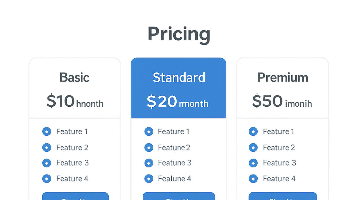
Transparent pricing tiers
Clearly define and label each plan, making it easy to compare features and costs.
- Distinct plan names:
Use memorable names that reflect the value or target audience of each plan.
- Feature comparison table:
Side-by-side tables help users quickly see what’s included in each tier.
- Distinct plan names:
-
Clear feature descriptions
Break down each plan’s features in plain language.
- Bullet points:
List key features concisely for easy scanning.
- Tooltips or modals:
Provide additional details without overcrowding the main layout.
- Bullet points:
-
Prominent call-to-action buttons
CTAs should stand out visually and clearly state the next step.
- Color contrast:
Ensure buttons are easily distinguishable from the background.
- Action-oriented labels:
Use verbs like “Start Free Trial” or “Get Started” to encourage clicks.
- Color contrast:
-
Accessible design
Ensure the page meets accessibility standards for all users.
- Font size and contrast:
Use legible text sizes and sufficient color contrast.
- Keyboard navigation:
Allow users to navigate and activate CTAs using a keyboard.
- Font size and contrast:
How to Evaluate Pricing Page Clarity with Prevue.me
Leverage prevue.me to gain data-driven feedback on your pricing page’s clarity and effectiveness.
-
Automated critique for cro
prevue.me scans your pricing page and highlights conversion blockers.
- Unclear ctas:
Identifies buttons or labels that don’t clearly indicate the next step.
- Complex plan options:
Suggests simplifications when too many choices overwhelm visitors.
- Unclear ctas:
-
Ux & accessibility feedback
Analyzes user flow and checks for accessibility compliance issues.
- Color contrast checks:
Ensures text and buttons meet WCAG contrast ratios.
- Keyboard interaction tests:
Verifies that all interactive elements are reachable via keyboard.
- Color contrast checks:
-
Seo optimization insights
Evaluates headings, schema markup, and page performance.
- Heading structure:
Recommends SEO-friendly headings and subheadings.
- Meta and schema tags:
Highlights missing or suboptimal tags for richer search results.
- Heading structure:
Examples of Clear Pricing Pages
Real-world examples illustrate how leading SaaS companies structure their pricing for maximum clarity.
-
Prevue.me’s pricing page
Features tiered plans with concise feature lists, bold CTAs, and clear value propositions.
-
Stripe’s pricing page
Uses interactive toggles for annual vs. monthly pricing and clean, minimalist design.
-
Hubspot’s pricing page
Highlights value through detailed comparison tables and strategic use of color to guide decisions.
Common Pitfalls and How to Avoid Them
Avoid these frequent mistakes that can undermine the clarity and effectiveness of your pricing page.
-
Overwhelming options
Too many plans or add-ons can confuse users and increase drop-off rates.
- Limit to 3-4 options:
Offer a manageable number of choices to simplify decision-making.
- Use progressive disclosure:
Hide advanced or additional options until needed.
- Limit to 3-4 options:
-
Hidden fees and conditions
Unexpected costs erode trust and lead to cart abandonment.
- Display all fees upfront:
Make one-time or recurring fees immediately visible.
- Use clear disclaimers:
Provide concise explanations for any terms or conditions.
- Display all fees upfront:
-
Complex terminology
Jargon or technical terms can alienate non-expert users.
- Use plain language:
Write descriptions that are easy to understand at a glance.
- Provide tooltips:
Offer brief in-context explanations for necessary technical terms.
- Use plain language:
-
Poor mobile responsiveness
Non-responsive layouts frustrate mobile visitors and reduce engagement.
- Test on multiple devices:
Ensure the layout adapts smoothly to different screen sizes.
- Optimize button sizes:
Make CTAs large enough for easy tapping on touchscreens.
- Test on multiple devices: