Published on 2025-06-29T21:33:09Z
What is a Product Page CTA? Examples & Best Practices
A Product Page CTA (Call to Action) is the primary interactive element on a product page that prompts visitors to take a desired action—for example, Add to Cart, Start Free Trial, or Get a Demo. Effective CTAs guide users through the conversion funnel by combining persuasive copy, standout design, and strategic placement. In CRO and UX, a well-crafted CTA can significantly boost click-through and conversion rates, while in SEO it can improve user engagement metrics like time on page and bounce rate. To ensure accessibility, CTAs should use semantic HTML and ARIA labels so all users can interact with them. Tools like Prevue.me offer actionable critiques to refine your CTAs for maximum lead generation, UX improvements, SEO compliance, and accessibility enhancements.
Product page cta
A Product Page CTA is the main button or link driving users to purchase, sign up, or request a demo on a product page.
Understanding Product Page CTAs
A Product Page CTA is the primary prompt that encourages visitors to take a desired action on a product page. CTAs are critical for guiding users through the conversion funnel and directly impact key metrics like click-through rate (CTR) and conversion rate. They must balance persuasive copy, visual prominence, and accessibility. In CRO, UX, and SEO contexts, a well-designed CTA can reduce friction, comply with best practices (e.g., semantic HTML), and support A/B testing initiatives.
-
Definition and purpose
A CTA, or Call to Action, is a button or link that invites users to complete an action—such as ‘Add to Cart’, ‘Start Free Trial’, or ‘Get a Demo’. It serves as the final step in the user journey on a product page.
-
Impact on cro, ux, and seo
Optimized CTAs improve conversion rates by reducing friction and clarifying next steps. They enhance UX by providing clear guidance and assist SEO by improving user engagement signals like time on page and bounce rate.
Best Practices for Product Page CTAs
Applying best practices ensures your CTA stands out, conveys value, and remains accessible. Key focus areas include copywriting, visual design, placement, and semantic markup. Below are fundamental guidelines to craft high-performing CTAs.
-
Copy and messaging
Use concise, action-oriented language that conveys clear value. Incorporate benefit-driven microcopy and, where appropriate, urgency or personalization.
- Action verbs:
Start with strong verbs like ‘Buy’, ‘Join’, or ‘Download’ to prompt immediate activity.
- Value proposition:
Convey the primary benefit, e.g., ‘Get 20% Off’ or ‘Free 14-Day Trial’.
- Urgency and scarcity:
Use time-sensitive phrases like ‘Limited Time Offer’ to encourage faster decisions.
- Action verbs:
-
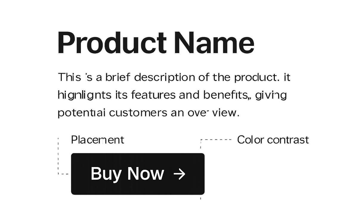
Design and visual hierarchy
Make the CTA visually distinct with color contrast, appropriate sizing, and whitespace. Position it where users can easily spot and interact with it, typically above the fold and near persuasive content.
- Color contrast:
Choose a button color that stands out against the background for instant visibility.
- Button size and shape:
Ensure the button is large enough to tap or click easily, with rounded corners if it fits your brand.
- Strategic placement:
Place CTAs near product descriptions, pricing, or features to align with user interest.
- Color contrast:
-
Seo and accessibility
Implement CTAs using semantic HTML and ARIA labels for screen readers. Ensure mobile responsiveness and fast load times to support SEO and accessibility.
- Semantic html:
Use a
<button>or correct<a>tag. For example:<button type="button" class="cta-btn">Buy Now</button> - Aria labels:
Provide
aria-labelto describe the button action for screen readers, e.g.,aria-label="Start your free trial". - Responsive design:
Ensure the CTA scales and remains tappable on mobile devices.
- Semantic html:
Examples of Effective CTAs (Prevue.me Critiques)
Real-world CTA examples with actionable feedback generated by prevue.me. Analyze how leading websites optimize copy, design, and placement to maximize lead generation and UX.
-
Prevue.me cta
On the prevue.me homepage, the primary CTA reads ‘Get Actionable Critiques’. It clearly communicates value and invites immediate engagement.
- Copy clarity:
‘Get Actionable Critiques’ is direct, benefit-focused, and sets clear expectations.
- Visual contrast:
The button’s bright orange color against a white background draws attention instantly.
- Placement:
Positioned above the fold near the hero image for maximum visibility.
- Copy clarity:
-
Shopify 'add to cart'
Shopify product pages feature a bold ‘Add to Cart’ button that dynamically updates the cart icon, reinforcing action feedback.
-
Slack 'start free trial'
Slack uses ‘Start Free Trial’ with supporting microcopy ‘No credit card required’ to reduce perceived risk and increase conversions.
Measuring and Optimizing CTA Performance
Continuous measurement and experimentation are key to maximizing CTA effectiveness. Track relevant metrics, run tests, and iterate based on data-driven insights.
-
Key performance metrics
Monitor metrics like click-through rate (CTR), conversion rate, and bounce rate to assess CTA success.
- Ctr:
Percentage of page visitors who click the CTA.
- Conversion rate:
Percentage of visitors who complete the desired goal after clicking.
- Bounce rate:
Share of visitors who leave the page without any interaction.
- Ctr:
-
A/b testing
Test different CTA variations—copy, color, size, placement—to determine the most effective design.
-
Heatmaps and user recordings
Use tools like Hotjar or prevue.me to visualize user interactions and identify usability issues.