Published on 2025-06-29T19:54:39Z
What is Button Design? Examples and Best Practices
Button design refers to the strategic creation of clickable elements — such as call-to-action (CTA) buttons — that guide users toward desired actions on a website. This term encompasses visual styling (color, shape, size), microcopy (button text), placement, and accessibility attributes to optimize conversion rates, user experience (UX), search engine performance (SEO), and inclusivity. Poorly designed buttons can confuse users, hinder conversions, and violate accessibility guidelines, while well-crafted buttons draw attention, clearly communicate intent, and improve interaction metrics. Tools like Prevue.me provide detailed CRO, UX, SEO, and accessibility critiques to help teams refine their buttons for maximum lead generation and user satisfaction. By iterating on button designs through user testing and A/B testing, businesses can continuously improve engagement and ROI. A polished button design not only boosts direct conversions but also enhances brand perception and trust.
Button design
Strategic design of website buttons to optimize conversions, UX, SEO, and accessibility.
Importance of Button Design
Button design plays a pivotal role in guiding user behavior and achieving business goals. Even small tweaks can have outsized impacts on click-through rates, form submissions, and overall engagement metrics.
-
Impact on conversion rate
Buttons are often the final interaction before a conversion. Well-optimized designs can significantly boost click-through and submission rates, directly affecting revenue.
-
Role in user experience (ux)
Clear, intuitive buttons reduce user friction by signaling clickable elements and expected outcomes, improving satisfaction and ease of navigation.
-
Seo and accessibility benefits
While not a direct ranking signal, clear and accessible buttons contribute to positive user behavior metrics like time on page and bounce rate, indirectly benefiting SEO. Accessible buttons ensure all users can interact, aligning with WCAG standards.
Key Elements of Effective Button Design
Designing high-performing buttons requires balancing aesthetics, messaging, and usability. Each element—from color to copy—should support the button’s purpose and context within the user journey.
-
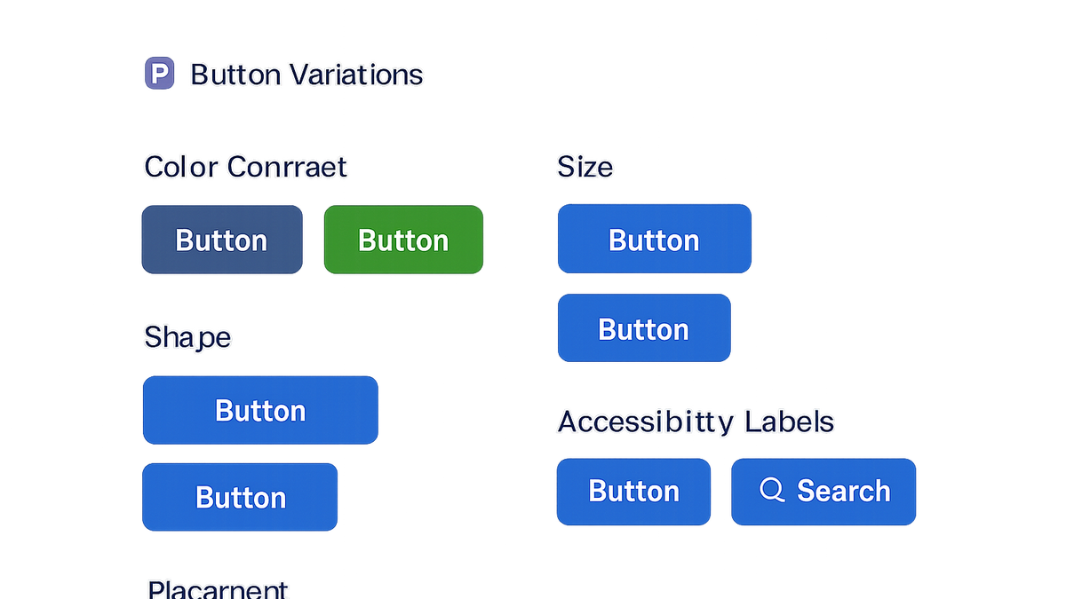
Visual hierarchy & contrast
Use color contrast and size to make primary actions stand out. Adhere to WCAG contrast ratios (4.5:1 for normal text) for readability and accessibility.
-
Microcopy and messaging
Craft concise, action-oriented text (e.g., ‘Get Started’, ‘Download Now’) that sets clear expectations for the next step.
-
Size, shape & spacing
Ensure buttons are large enough to click or tap comfortably, with adequate padding and margin to prevent misclicks.
-
Placement & context
Position buttons near related content or form fields where users expect them. Maintain consistent placement across pages to build familiarity.
-
Accessibility attributes
Include ARIA roles, labels, and focus states to support users with assistive technologies.
- Aria roles:
Use semantic <button> tags or role=“button” to communicate purpose to screen readers.
- Keyboard navigation:
Ensure buttons are reachable and operable via keyboard with logical tab order.
- Focus styles:
Provide visible focus outlines or styles for users navigating without a mouse.
- Aria roles:
Best Practices for Button Design
Follow established best practices to maintain consistency and optimize performance across devices and user segments.
-
Use action-oriented text
Begin microcopy with strong verbs to prompt immediate action, and avoid vague terms like ‘Submit’.
-
Maintain consistent style
Define and adhere to a button design system or component library to ensure uniformity across your site.
-
Ensure mobile responsiveness
Optimize button size, spacing, and touch targets according to mobile guidelines; generally, 44x44px minimum.
-
Optimize load performance
Keep button assets lean—avoid heavy shadows or large background images that slow render times.
-
Iterate with a/b testing
Continuously test variations of color, copy, size, and placement to discover the most effective combination.
- Test color variations:
Compare contrasting hues to determine which drives more clicks.
- Evaluate copy changes:
Experiment with phrasing to see which resonates best.
- Test placement options:
Try button in different page sections to optimize visibility.
- Test color variations:
Examples and Code Snippets
Analyzing real-world buttons and reviewing code snippets can provide practical insights into successful designs.
-
Real-world example: amazon 'add to cart'
Amazon uses a high-contrast orange button with clear ‘Add to Cart’ text directly below the price, maximizing visibility and ease of use.
-
Case study: lead gen form submit button
A SaaS company increased form submissions by 25% after changing their submit button text from ‘Submit’ to ‘Get My Free Trial’ and adjusting its color to match brand cues.
-
Code snippet: accessible html button
<button type="button" aria-label="Subscribe to newsletter" class="btn btn-primary">
  Subscribe
</button>
Leveraging Prevue.me for Button Critiques
prevue.me helps you uncover actionable insights on button design across CRO, UX, SEO, and accessibility, streamlining optimization efforts.
-
Submit your website to prevue.me
Enter your URL and specify you want a button design critique to get targeted feedback.
-
Analyze visual and ux feedback
Review prevue.me’s recommendations on color contrast, hierarchy, and microcopy for improved engagement.
-
Implement recommendations
Prioritize fixes based on potential impact and development effort to iterate efficiently.
-
Monitor performance & roi
Track metrics like click-through rate, conversions, and accessibility compliance to measure success.