Published on 2025-06-29T21:05:59Z
What Are SaaS Pricing Toggles? Examples for CRO/UX/SEO Critiques
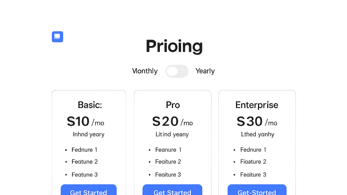
SaaS Pricing Toggles are interactive switches on SaaS websites that let users toggle between different billing options—typically monthly and annual plans. By giving prospects control over how they view pricing, toggles enhance clarity, reduce friction, and drive higher conversions. For CRO specialists, well-designed toggles become powerful tools for experiments and data-driven optimizations. From a UX perspective, clear labeling and state indicators prevent confusion and improve satisfaction. SEO practitioners must also ensure that dynamic content swaps don’t hide content from search engines or create crawl issues. This article explores the importance of pricing toggles, best practices for implementation, common pitfalls to avoid, and a real-world critique using Prevue.me.
Saas pricing toggles
Interactive UI elements that let SaaS users switch between pricing views (monthly vs annual), impacting CRO, UX, accessibility, and SEO.
Why SaaS Pricing Toggles Matter
Pricing toggles play a key role across CRO, UX, and SEO strategies. They empower users to explore options, test preferences, and make informed decisions. A well-designed toggle can increase click-throughs, reduce bounce rates, and improve overall engagement metrics.
-
Conversion rate optimization (cro)
Toggles enable quick A/B style comparisons between pricing models without page reloads, reducing friction and boosting conversions. They support running experiments to identify the optimal default pricing view.
- Reduced click friction:
Users can switch pricing views instantly, minimizing navigation steps and abandonment.
- Data-driven defaults:
Set the default toggle state based on experiment results to maximize sign-ups.
- Reduced click friction:
-
User experience (ux)
Interactive toggles simplify decision-making by presenting options side-by-side. Clear labels and state indicators prevent confusion and improve satisfaction.
- Visual clarity:
Use distinct colors and labels to indicate active states and pricing differences.
- Cognitive load reduction:
Minimize text and offer concise plan highlights to help users compare quickly.
- Visual clarity:
-
Seo considerations
Dynamic content changes via toggles can affect crawlability and indexation. Proper use of server-side rendering or unique URLs ensures search engines see all pricing options.
- Server-side rendering:
Render both pricing views in HTML or provide crawlable snapshots to avoid hidden content.
- Canonicalization:
Use canonical tags when multiple URLs represent similar content to prevent duplicate indexing.
- Server-side rendering:
Best Practices for Implementing Pricing Toggles
Adhering to UX and accessibility standards ensures your toggles are both effective and inclusive. Efficient technical implementation reduces load times and maintains SEO integrity.
-
Design and placement
Position toggles near plan headers or pricing tables where users expect them. Label them clearly (e.g., “Monthly / Annual”).
- Responsive layout:
Ensure toggles adapt to mobile and desktop with touch-friendly targets.
- Contrast and visibility:
Maintain sufficient color contrast for users with visual impairments.
- Responsive layout:
-
Accessibility
Implement keyboard navigation and ARIA roles (e.g.,
aria-checked) to make toggles operable by assistive technologies.- Semantic markup:
Use
<button role="switch">or<input type="checkbox">with proper labels. - Focus management:
Provide visible focus indicators and manage focus order logically.
- Semantic markup:
-
Technical implementation
Use lightweight JavaScript or server-rendered solutions to switch pricing content, preserving SEO and performance.
- Html example:
<div class="pricing-toggle"> <label for="billing-toggle">Billing:</label> <input type="checkbox" id="billing-toggle" aria-label="Toggle between monthly and annual pricing" /> </div> <script> // JS to switch pricing views </script> - Performance optimization:
Debounce event handlers and lazy-load non-critical assets to prevent jank.
- Html example:
Examples and Critiques Using Prevue.me
Applying theory to practice, let’s critique prevue.me’s pricing toggle implementation for CRO, UX, SEO, and accessibility to derive actionable improvements.
-
Prevue.me annual vs monthly toggle
prevue.me uses a clear toggle switch above its pricing table but defaults to annual plans, which may bias users.
- Default bias:
Consider testing monthly-first defaults to see if it attracts users sensitive to lower upfront costs.
- Visibility on mobile:
On small screens, the toggle shrinks; increasing touch target size can improve usability.
- Default bias:
-
Seo impact on prevue.me
The site uses client-side JS to swap prices, hiding monthly pricing from bots without SSR fallback.
- Add ssr or prerendering:
Serve both pricing versions in HTML or use prerendering services to surface content to crawlers.
- Structured data:
Include
Offerschema for both monthly and annual prices to enhance SERP features.
- Add ssr or prerendering:
-
Accessibility audit of prevue.me
The toggle lacks ARIA roles, making it invisible to screen readers.
- Implement aria attributes:
Use
role="switch"andaria-checkedto convey state. - Keyboard support:
Ensure users can toggle plans using the Tab and Space keys.
- Implement aria attributes:
Common Mistakes to Avoid
Even minor flaws in toggle design or implementation can hurt conversions, accessibility, and SEO. Avoid these pitfalls to maintain a high-quality pricing experience.
-
Hidden defaults
Not signaling default toggle state biases users without their awareness.
- Neutral defaults:
Start with no pre-selection or test different defaults through A/B testing.
- Neutral defaults:
-
Tiny touch targets
Small toggles frustrate mobile users.
- Expand hit areas:
Use at least 44×44px targets per WCAG guidelines.
- Expand hit areas:
-
Overloading with animations
Excessive animations slow down interactions and distract users.
- Subtle transitions:
Use minimal, performant CSS transitions.
- Subtle transitions: