Published on 2025-06-29T20:16:14Z
What is Sign-Up Form Simplicity? Best Practices for CRO, UX, and SEO
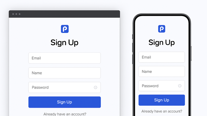
Sign-Up Form Simplicity refers to the practice of minimizing the number of fields and reducing friction in registration or subscription forms on websites. By focusing on essential data points and clear design, it accelerates user completion and supports higher conversion rates.
Complex or lengthy forms can overwhelm visitors, leading to increased abandonment and lost leads. Simplified forms also improve accessibility by ensuring users with disabilities can navigate and complete them effortlessly. From an SEO standpoint, faster form interaction can contribute to improved dwell times and lower bounce rates, signaling quality content to search engines.
Studies have shown that reducing form fields can boost lead volume by up to 20%. SaaS solutions like Prevue.me provide in-depth critiques across CRO, UX, accessibility, and SEO, helping teams refine their sign-up flows.
Sign-up form simplicity
Minimizing sign-up form fields and steps to boost conversion, UX, accessibility, and SEO.
Why Sign-Up Form Simplicity Matters
Streamlined sign-up forms play a crucial role in website optimization by reducing friction, improving user experience, and driving higher conversion rates. Complex forms can deter users, leading to form abandonment and missed lead generation opportunities. Moreover, simple forms enhance accessibility by ensuring that users with disabilities can complete them without obstacles. From an SEO perspective, faster form completion can lead to improved dwell time and reduced bounce rates, signaling quality to search engines. Prioritizing simplicity aligns with best practices in CRO, UX, and accessibility.
-
Improved conversion rates
Fewer fields lower the commitment barrier, making users more likely to complete the sign-up process.
-
Enhanced user experience
A concise form reduces cognitive load, guiding users smoothly through the sign-up flow.
-
Reduced form abandonment
Simplifying the form mitigates frustration and drop-offs, increasing overall lead capture.
Key Principles of Form Simplicity
Adhering to core principles ensures that sign-up forms remain user-friendly and effective. Focus on field minimization, logical grouping, and progressive profiling. Consistent design patterns, clear labels, and responsive layouts further support accessibility and mobile optimization. Each principle contributes to a frictionless user journey, directly impacting CRO, UX, and SEO metrics.
-
Field minimization
Ask only for essential information (e.g., email and password) to reduce friction.
- Example:
Replace full address fields with optional profile completion post-sign-up.
- Example:
-
Logical flow
Organize fields in a natural order to align with user expectations.
- Grouping:
Group related fields (e.g., personal vs. professional) to improve readability.
- Grouping:
-
Progressive profiling
Collect additional details over time rather than all at once to maintain user engagement.
Examples and Best Practices
Implementing proven design strategies and real-world examples can significantly enhance form performance. Use single-column layouts, clear CTAs, and inline validation. Testing variations via A/B experiments helps identify the optimal form structure. Accessibility checks, such as proper labeling and keyboard navigation, ensure compliance with WCAG standards.
-
Single-column layout
A vertical flow prevents users from scanning side-to-side, focusing attention on one field at a time.
-
Clear call-to-action
Use descriptive button text (e.g., “Start Your Free Trial”) and contrasting colors for prominence.
-
Inline validation
Provide real-time feedback on field errors to help users correct mistakes immediately.
Tools and SaaS Solutions
Several tools can audit, test, and optimize sign-up forms for simplicity. Leveraging specialized SaaS platforms streamlines the process of identifying friction points and implementing improvements.
-
Prevue.me integration
prevue.me provides actionable CRO, UX, accessibility, and SEO critiques, highlighting unnecessary fields, recommending design tweaks, and benchmarking performance against industry standards.
-
A/b testing platforms
Tools like Optimizely and VWO enable experimentation with form variations to determine the highest-converting design.
-
Analytics suites
Google Analytics and Hotjar reveal user behavior, such as form drop-off rates and time-to-complete metrics.
