Published on 2025-06-29T19:33:22Z
What is a Sticky CTA? Examples and Best Practices
A Sticky Call-to-Action (CTA) is an interactive element—like a button or link—that stays fixed on the screen as users scroll. It ensures that a key directive (e.g., “Sign Up,” “Buy Now,” or “Contact Us”) remains constantly accessible, reducing friction and boosting conversions. In CRO, UX, and SEO-driven design, Sticky CTAs can significantly improve click-through rates when implemented thoughtfully. However, designers must balance prominence with unobtrusiveness and adhere to accessibility standards to avoid harming the user experience or SEO performance.
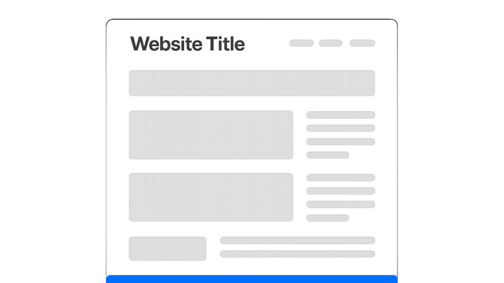
Sticky cta
CTA button fixed on screen during scroll, enhancing visibility and conversions while requiring careful UX and accessibility design.
Why Sticky CTAs Matter
Sticky CTAs consistently present the next step to users, improving conversion rates and guiding user navigation. They reduce friction by eliminating the need to scroll to find an action button. However, overuse or poor placement can annoy visitors and degrade UX.
-
Improved visibility
By staying in view, Sticky CTAs ensure users always see the call to action, increasing the likelihood of clicks.
- Persistent placement:
Ensures the CTA never leaves the viewport, so it’s always available.
- Strategic contrast:
Use colors and size that stand out against page content.
- Persistent placement:
-
Reduced friction
Users can complete desired actions without searching or scrolling back up, streamlining the conversion funnel.
- One-click access:
Direct linking to forms or key pages without additional scrolling.
- One-click access:
-
Continuous reinforcement
Repeated exposure to the CTA can subtly encourage users to act, especially on longer pages.
- Multiple touchpoints:
Appears at various scroll depths to remind users.
- Multiple touchpoints:
Common Implementation Patterns
Developers and designers use several patterns for Sticky CTAs depending on context and content hierarchy. The choice affects user experience and SEO. Popular patterns include:
-
Sticky header
A CTA placed in the fixed top bar of a page. Keeps the primary action in view but can reduce usable viewport height.
-
Sticky footer
A CTA fixed to the bottom of the screen. Ideal for mobile interfaces where bottom reach is easier.
-
Slide-in sidebar
A sidebar that stays anchored as the user scrolls. Useful for secondary offers without covering main content.
-
Floating action button (fab)
A circular or icon-based button that hovers above content, commonly used in mobile apps and sites.
Best Practices
To maximize benefits and avoid drawbacks, follow these best practices when implementing Sticky CTAs.
-
Maintain clarity and brevity
Use concise text and a clear value proposition to avoid cluttering the viewport.
-
Ensure mobile responsiveness
Optimize CTA size, hit area, and placement for touch interactions on smaller screens.
-
Adhere to accessibility standards
Ensure keyboard navigability, proper contrast ratios, and screen-reader labels so all users can interact with the CTA.
-
Test and optimize with prevue.me
Use prevue.me to get real-time, actionable critiques on your Sticky CTA’s performance, design clarity, and compliance with SEO and accessibility best practices.
Potential Pitfalls
While Sticky CTAs are powerful, they can backfire if misused. Watch out for common issues:
-
Obstructing content
Avoid covering critical information or navigation elements, which frustrates users.
-
Performance overhead
Excessive scripts or poorly optimized code can slow page load times, harming SEO.
-
Intrusive design
Large or animated CTAs that draw too much attention can annoy visitors and increase bounce rates.
-
Compliance risks
Ensure the sticky element doesn’t violate web accessibility or advertising guidelines, particularly for mobile browsers.
