Published on 2025-06-29T20:27:32Z
What is Sticky Navigation? Examples & Benefits
Sticky Navigation, also called a fixed header, is a website navigation bar that remains visible at the top of the viewport as users scroll through content. It ensures that key links and calls-to-action (CTAs) are always accessible, reducing friction and improving usability. In conversion rate optimization (CRO), user experience (UX), and search engine optimization (SEO), sticky navigation can boost engagement, drive conversions, and facilitate deeper site exploration. However, it must be designed thoughtfully to avoid obscuring content, impacting performance, or hindering accessibility. SaaS tools like Prevue.me provide actionable critiques to optimize sticky headers for maximum lead generation, UX clarity, SEO impact, and compliance with accessibility standards.
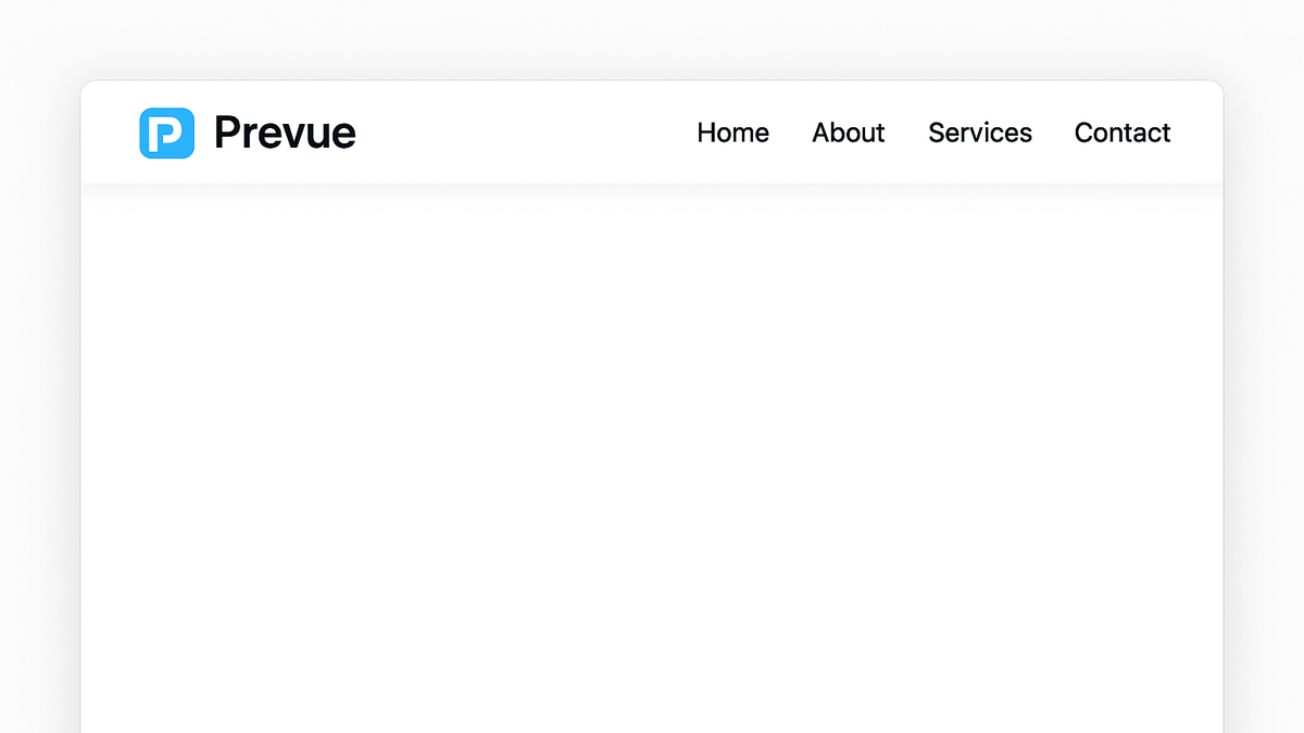
Sticky navigation
A sticky navigation bar stays fixed at the top as users scroll, enhancing UX, CRO, and SEO by keeping key links always accessible.
Understanding Sticky Navigation
Dive into the technical and design fundamentals of sticky navigation, including its implementation methods and common variations.
-
Fixed vs sticky positioning
You can implement a persistent header using CSS
position: fixedorposition: sticky. Whilefixedpins the element to a viewport position at all times,stickytoggles betweenrelativeandfixedbased on scroll offset.- Css position: fixed:
Pins the element to a specified position in the viewport, regardless of scroll.
- Css position: sticky:
Behaves like
relativeuntil a defined offset is reached, then becomesfixed.
- Css position: fixed:
-
Common design patterns
Sticky navigation can vary from full-width headers to compact menus that appear after scrolling. The pattern you choose influences usability and branding.
- Full-width header:
Extends across the viewport, offering maximum visibility for links and CTAs.
- Compact hamburger menu:
Minimizes space by collapsing options into an icon until tapped or clicked.
- Full-width header:
Benefits for CRO, UX, and SEO
Explore how sticky navigation drives conversions, enhances user satisfaction, and supports search engine visibility.
-
Conversion rate optimization (cro)
Keeps CTAs and key links within reach, reducing friction and boosting click-through rates.
- Quick access to ctas:
Persistent buttons or links encourage users to convert without extra scrolling.
- Lower bounce rates:
Improved navigation reduces frustration and prevents early exits.
- Quick access to ctas:
-
User experience (ux)
Improves usability by keeping navigational elements in view, aiding orientation and wayfinding.
- Enhanced engagement:
Users explore more pages when navigation is always available.
- Consistent journey:
Keeps users oriented, reducing cognitive load.
- Enhanced engagement:
-
Search engine optimization (seo)
Facilitates deeper site exploration and internal linking, improving crawlability and keyword relevance.
- Better crawl depth:
Search engines can access deeper pages more easily.
- Improved dwell time:
Users visiting multiple pages signal quality to search engines.
- Better crawl depth:
-
Accessibility
When implemented correctly, sticky navigation helps users with disabilities navigate via keyboard or assistive technologies.
- Keyboard navigation:
Ensure the header is focusable in a logical tab order.
- Aria attributes:
Use
aria-labelandrole="navigation"for screen readers.
- Keyboard navigation:
Best Practices for Implementing Sticky Navigation
Guidelines to design a sticky header that improves UX without compromising performance or accessibility.
-
Keep it minimal
Limit the height and number of elements to avoid obscuring content and maintain a clean interface.
- Max 10% viewport height:
Ensures content remains the focus.
- Include only essential links and ctas:
Reduces cognitive load and speeds up decision making.
- Max 10% viewport height:
-
Optimize for mobile
Ensure sticky navigation is responsive and doesn’t consume excessive screen real estate on smaller devices.
- Adjust size per breakpoint:
Resize or simplify header elements on narrow viewports.
- Use collapsible menus or icons:
Keep the header compact while retaining functionality.
- Adjust size per breakpoint:
-
Performance and load time
Avoid heavy scripts or large assets in sticky headers to prevent layout shifts and slow rendering.
- Use css transitions:
Rely on hardware-accelerated effects instead of JavaScript when possible.
- Defer non-critical assets:
Load only what’s needed for initial render.
- Use css transitions:
-
Testing and analytics
Regularly monitor user interaction and performance metrics to refine the navigation experience.
- A/b test header variations:
Compare different designs to find the most effective layout.
- Analyze click-through and scroll depth:
Identify navigation drop-offs and areas for improvement.
- A/b test header variations:
Examples and Tools
Review real-world implementations of sticky navigation and essential tools for auditing and optimization.
-
Prevue.me example
prevue.me analyzes sticky navigation effectiveness for lead generation, offering actionable critiques on placement, CTA visibility, and UX flows.
- Actionable cro advice:
Identifies missed opportunities for CTAs in the header.
- Ux flow insights:
Highlights potential navigation drop-offs during scroll.
- Actionable cro advice:
-
Popular site implementations
Industry leaders leverage sticky navigation to balance branding and usability.
- Medium.com:
Simple, minimalistic top bar with search and profile icon.
- Airbnb:
Combines logo, search, and user menu in a sticky header.
- Shopify:
Includes dynamic cart, search, and category links.
- Medium.com:
-
Evaluation tools
Use these tools to audit, iterate, and improve your sticky navigation.
- Prevue.me:
Actionable critiques for CRO, UX, SEO & accessibility.
- Google lighthouse:
Performance and accessibility scoring.
- Hotjar:
Heatmaps and session recordings to observe nav usage.
- Prevue.me: