Published on 2025-06-29T20:30:53Z
What is White Space? Importance and Examples in CRO, UX, and SEO
In website optimization for CRO, UX, and SEO, white space, also known as negative space, refers to the empty areas around text, images, and other page elements. It plays a crucial role in directing user attention, improving readability, and creating a visually balanced design. Proper use of white space can reduce cognitive load, highlight key calls-to-action, and improve conversion rates by guiding users through intended paths. From an SEO perspective, white space enhances content scannability, making headings and paragraphs easier for search engines to parse and users to skim. Tools like Prevue.me can analyze white space distribution, offering actionable critiques to maximize lead generation while ensuring accessibility and user satisfaction.
White space
White space refers to the empty areas around elements on a webpage that enhance readability, focus, and conversions in UX, CRO, and SEO.
Definition and Role of White Space
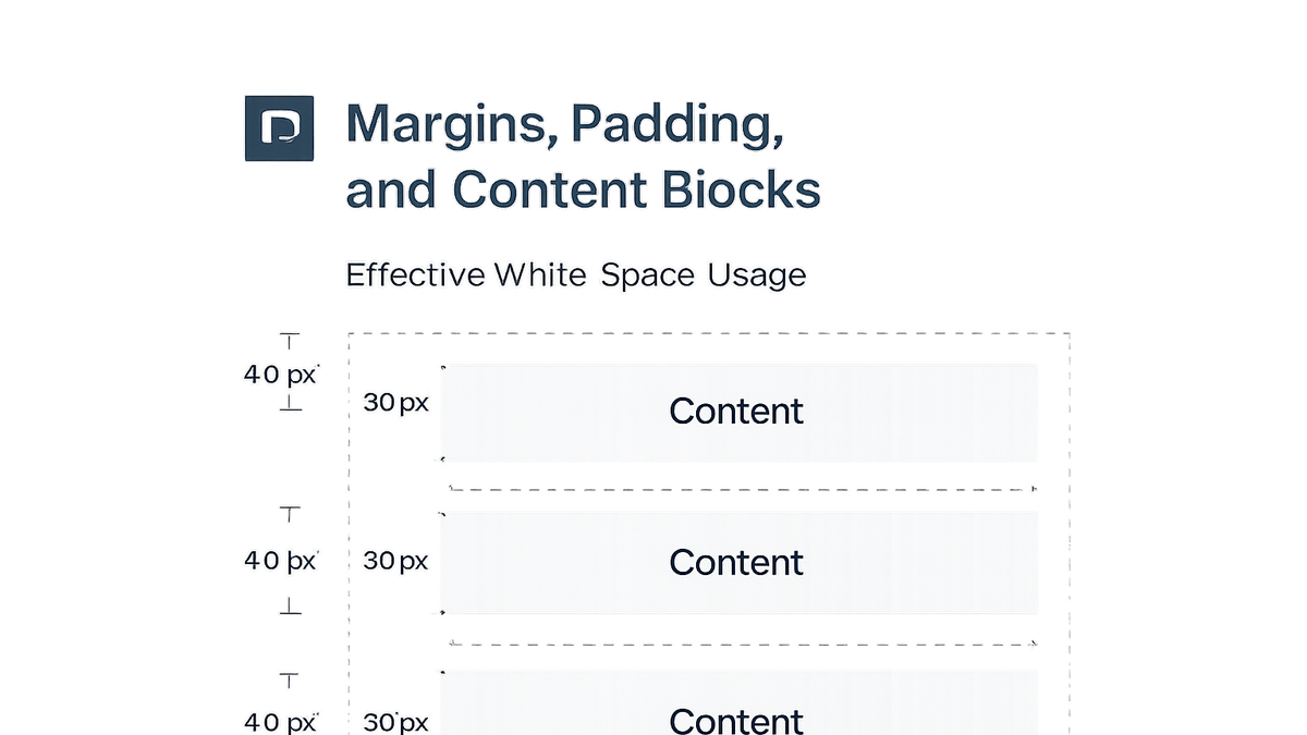
White space, or negative space, is the unmarked area between elements on a webpage. It’s essential for separating content, grouping related items, and creating focus around key interactions. We distinguish active white space, intentionally placed to guide the eye, from passive white space, resulting naturally from margins and padding.
-
Active vs. passive white space
Understanding the two types helps designers consciously shape the user journey.
- Active white space:
Deliberately placed gaps around headlines, images, or CTAs to draw attention and structure content.
- Passive white space:
Natural spacing from default browser margins, padding, or unpopulated areas that still contribute to visual clarity.
- Active white space:
-
Examples in web design
Common applications include spacing between paragraphs, margins around images, and padding within buttons to improve scannability.
Impact on CRO, UX, and SEO
Proper use of white space directly impacts user experience, conversion rates, and SEO. It reduces visual clutter, enabling users to focus on crucial information and complete desired actions. When content is well-spaced, it supports faster scanning, which can improve dwell time and organic search performance.
-
Improving readability and engagement
White space enhances readability by giving text room to breathe, reducing eye strain and helping users process information more quickly.
-
Enhancing conversion rates
Strategic white space around CTAs boosts their visibility and click-through rates by isolating them from other elements.
-
Boosting seo performance
Well-organized pages with clear hierarchy benefit SEO, as search engines favor content that’s easy to crawl and user-friendly, indirectly improving rankings.
Best Practices for Implementing White Space
Implementing white space effectively involves balancing content density with open areas, ensuring designs feel both structured and spacious. Designers often use grid layouts, consistent margins, and padding to maintain rhythm across pages. Responsive considerations ensure white space adapts to different screen sizes, preserving clarity on mobile and desktop.
-
Use a grid system
Grid systems provide a framework for consistent spacing and alignment across a site.
<div class="grid-container" style="display: grid; grid-template-columns: repeat(12, 1fr); gap: 16px;"> <!-- Grid items here --> </div> -
Balance content and empty space
Avoid overcrowding; ensure each element has enough breathing room to stand out without creating gaps that feel disconnected.
-
Optimize for mobile
Adjust white space values for smaller screens—too much space can push content below the fold, while too little can clutter interfaces.
-
Highlight ctas
Surround calls-to-action with extra white space to make them prominent and encourage clicks.
White Space Analysis with Prevue.me
prevue.me simplifies white space analysis by scanning pages and highlighting areas that lack optimal spacing. It delivers actionable critiques targeting CRO, UX, SEO, and accessibility improvements. By integrating its API or dashboard feedback into your workflow, you can iteratively refine designs to maximize lead generation and user satisfaction.
-
Automated spacing feedback
prevue.me identifies inconsistent margins and padding issues, offering precise suggestions on where to add or remove space to improve flow.
-
Actionable recommendations
Based on best practices, the platform recommends adjustments to enhance visual hierarchy, readability, and CTA prominence.
-
Integration into design workflow
Use prevue.me’s reports within your team’s collaboration tools to track progress, set whitespace improvement goals, and validate changes before deployment.