Published on 2025-06-29T19:43:10Z
What is Visual Hierarchy? Examples in Web CRO, UX & SEO
Visual hierarchy is the strategic arrangement of elements—such as typography, color, size, and spacing—to guide users’ attention through a web page. On websites optimized for CRO (Conversion Rate Optimization), UX, and SEO, a clear hierarchy ensures that headlines, images, and calls to action stand out in the intended sequence, boosting engagement and conversions. It reduces cognitive load by organizing content into digestible sections and emphasizes key interactions, like sign-up forms or purchase buttons.
From an SEO perspective, well-structured content enhances readability and dwell time, which can
positively impact rankings. Tools like Prevue.me analyze your site’s layout, identify
misaligned elements, poor contrast, and ineffective layouts, and offer actionable recommendations.
Mastering visual hierarchy leads to websites that not only look appealing but also guide users seamlessly
toward desired actions.
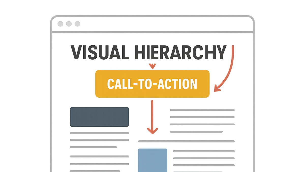
Visual hierarchy
Visual Hierarchy arranges page elements by importance to guide user attention and optimize conversion, usability, and SEO.
Why Visual Hierarchy Matters for CRO, UX & SEO
Visual hierarchy influences user perception and behavior across the conversion funnel. It drives attention to key elements, enhances usability, and can indirectly boost SEO by improving engagement metrics.
-
Conversion rate optimization (cro)
A clear hierarchy directs users to calls to action and priority content, increasing click-through and conversion rates.
- Cta emphasis:
Ensure primary call-to-action buttons are larger, more colorful, and positioned prominently to stand out.
- Directional cues:
Use arrows, lines, or gaze cues in imagery to guide users toward conversion points.
- Cta emphasis:
-
User experience (ux)
Organizing information in a logical flow reduces cognitive load and frustration, leading to higher satisfaction and retention.
- Progressive disclosure:
Reveal information gradually to prevent overwhelming users, showing only what’s relevant at each step.
- Visual grouping:
Use whitespace and borders to group related elements, making navigation intuitive.
- Progressive disclosure:
-
Search engine optimization (seo)
Well-structured content aids readability; users stay longer and interact more, which can improve SEO signals like dwell time.
- Readable headings:
Use clear heading hierarchies:
<h1>
<h2>
<h3>
to signal content structure to search engines and users. - Structured layouts:
A consistent layout helps search bots index content efficiently and improves user comprehension.
- Readable headings:
Principles of Visual Hierarchy
Key design principles help establish an effective visual hierarchy on web pages.
-
Size and scale
Larger elements attract more attention, so use scale to prioritize headlines and CTAs.
- Headline scaling:
Make primary headlines significantly larger than body text to establish clear importance.
- Button sizing:
Ensure clickable buttons are sized appropriately for visibility and usability.
- Headline scaling:
-
Color and contrast
High contrast and strategic color choices create focal points and differentiate elements.
- Contrast ratios:
Maintain sufficient contrast between text and background to ensure accessibility and clarity.
- Contrast ratios:
-
Position and proximity
Placement in the layout (e.g., top-left) and grouping related elements directs scan patterns.
- Z and f patterns:
Align key elements along natural reading patterns to guide the eye.
- White space:
Use whitespace to separate groups and focus attention on vital components.
- Z and f patterns:
Implementing Visual Hierarchy with Prevue.me
prevue.me offers automated critiques and actionable insights to optimize your site’s visual hierarchy for better performance.
-
Automated layout analysis
Analyzes element placement, size, and spacing to highlight hierarchy issues.
- Element detection:
Automatically detects headings, buttons, and media to assess their prominence.
- Flow mapping:
Visualizes user attention paths to identify potential bottlenecks.
- Element detection:
-
Contrast and accessibility checks
Evaluates color contrast and accessibility compliance to ensure clear separation.
- Wcag ratios:
Checks contrast against WCAG 2.1 standards for text and UI components.
- Color blindness simulation:
Simulates various color vision deficiencies to test accessibility.
- Wcag ratios:
-
Actionable recommendations
Provides prioritized suggestions to improve hierarchy and increase conversions.
- Priority ranking:
Ranks issues by impact on user flow and conversion potential.
- Implementation tips:
Offers design best practices and code snippets for fixes.
- Priority ranking:
Best Practices and Common Pitfalls
Adhering to best practices and avoiding typical mistakes ensures your visual hierarchy remains effective across devices and audiences.
-
Maintain consistency
Use a uniform typographic scale, color palette, and spacing system throughout your site.
- Design system:
Implement a design system to standardize elements and reinforce hierarchy.
- Style guides:
Document guidelines for typography, colors, and spacing to maintain coherence.
- Design system:
-
Avoid visual clutter
Too many competing elements can confuse users and weaken your hierarchy.
- Minimalism:
Keep layouts simple by removing non-essential elements.
- Focal point:
Limit the number of focal points to guide the eye effectively.
- Minimalism:
-
Test across devices
Responsive design can alter hierarchy; always validate on mobile, tablet, and desktop.
- Viewport testing:
Check that key elements remain prominent at different screen sizes.
- Cross-browser checks:
Ensure consistency across major browsers and devices.
- Viewport testing: