Published on 2025-06-29T19:09:37Z
What is a Landing Page? Examples and Best Practices
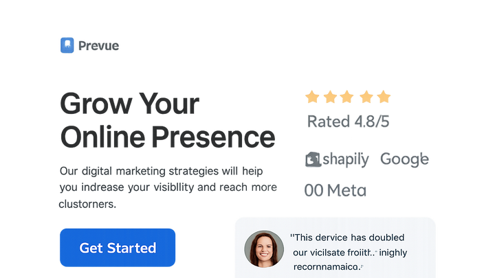
Landing Page refers to a standalone web page designed specifically to capture a visitor’s attention and persuade them to complete a particular task, such as filling out a form or making a purchase. In the context of CRO (Conversion Rate Optimization), UX (User Experience), and SEO (Search Engine Optimization), landing pages serve as high-impact entry points that drive targeted traffic and maximize conversions.
By focusing on a single goal and minimizing distractions, landing pages help marketers and designers fine-tune the elements that influence user behavior. They must balance compelling content, intuitive design, and technical optimization—ensuring fast load times, mobile responsiveness, and accessibility for all visitors. Tools like Prevue.me can provide actionable critiques spanning CRO, lead generation, SEO, UX, and accessibility, helping teams iterate toward higher-performing landing pages.
Landing page
A standalone web page focused on guiding visitors toward a specific action, optimized for conversion, UX, and SEO.
Why Landing Pages Matter in CRO/UX/SEO
Landing pages are crucial entry points for marketing campaigns, designed to focus visitors on a single objective. They bridge the gap between ad clicks and conversions, offering:
- Improved Conversion Rates: By removing distractions.
- Enhanced SEO: Through on-page optimization.
- Optimized UX: With targeted content and design.
-
Impact on conversion rate
Landing pages isolate a single offer or action, streamlining the path to conversion and boosting the percentage of visitors who complete the desired goal.
- Focused messaging:
Tailoring content to match user intent reduces confusion and increases the likelihood of conversion.
- Reduced distractions:
Removing navigation links and unrelated elements helps keep users on task.
- Focused messaging:
-
Seo considerations
Optimized landing pages improve search engine visibility, driving qualified organic traffic with relevant keywords and metadata.
- On-page optimization:
Including target keywords in titles, headings, and image alt text.
- Keyword targeting:
Aligning page content with the search intent of potential customers.
- On-page optimization:
-
Ux improvements
A clear, user-friendly layout guides visitors smoothly toward the conversion goal, reducing friction and drop-off rates.
- Clear navigation:
Using minimal, intuitive design to guide user focus.
- Mobile responsiveness:
Ensuring the landing page adapts flawlessly to different screen sizes.
- Clear navigation:
Key Elements of an Effective Landing Page
An effective landing page balances persuasive content, intuitive design, and technical performance. Core elements include:
- A compelling headline
- Engaging visuals
- Clear call-to-action (CTA)
- Optimized form fields
- Social proof and trust signals
-
Headline
A concise, benefit-driven statement that immediately communicates the value proposition.
-
Visuals
High-quality images or videos that reinforce the message and engage the visitor.
-
Call-to-action (cta)
A prominent, action-oriented button or link that tells users exactly what to do next.
- Placement:
Position the CTA above the fold and at logical points throughout the page.
- Copy:
Use clear, action-oriented language (e.g., “Get Your Free Trial”).
- Color:
Choose a contrasting hue to make the CTA stand out.
- Placement:
-
Form & fields
Keep forms short and only ask for essential information to minimize friction.
- Field count:
Limit to the minimum number of fields needed to qualify a lead.
- Labeling:
Use clear, descriptive labels and inline validation.
- Privacy assurance:
Include a brief privacy statement or link to build trust.
- Field count:
-
Social proof
Testimonials, reviews, or user counts that validate credibility and influence decisions.
-
Trust signals
Security badges, certifications, or partner logos that alleviate concerns.
- Security badges:
Display SSL or payment processor logos.
- Testimonials:
Show real quotes with names and photos when possible.
- Security badges:
Examples and Critiques with Prevue.me
Using prevue.me, teams can obtain in-depth critiques and suggestions across multiple dimensions: CRO, SEO, UX, and accessibility. Examples include:
-
Prevue.me cro critique
Actionable insights on button placement, messaging alignment, and form optimization to boost conversions.
- Actionable recommendations:
Specific A/B test ideas tailored to your page.
- A/b test suggestions:
Variants for headlines, CTAs, and layouts.
- Actionable recommendations:
-
Prevue.me seo audit
Analysis of on-page SEO factors like meta tags, heading structure, and content relevance.
- Title tag optimization:
Ensure unique, keyword-rich titles.
- Meta description review:
Craft compelling summaries to improve click-through rates.
- Content relevance:
Verify keyword usage aligns with user intent.
- Title tag optimization:
-
Prevue.me ux recommendations
Heatmap and click-tracking analysis to identify user friction and improve flow.
- Heatmap analysis:
Visualize where users click and scroll.
- Click tracking:
Measure engagement with interactive elements.
- Navigation flow:
Optimize the path users take toward conversion.
- Heatmap analysis:
-
Prevue.me accessibility feedback
Checks for WCAG compliance, color contrast, keyboard navigation, and alt text usage.
- Color contrast:
Ensure text is readable against backgrounds.
- Keyboard navigation:
Verify all elements are accessible via keyboard.
- Alt text:
Provide descriptive alternative text for images.
- Color contrast:
Best Practices and Common Pitfalls
Adhering to best practices while avoiding common pitfalls ensures landing page effectiveness. Some guidelines:
-
Consistency and relevance
Match messaging and visuals to the source ad or link to maintain user trust and context.
-
Page speed
Optimize images, minify code, and leverage caching to reduce load times.
-
Mobile optimization
Design with a mobile-first approach, ensuring touch-friendly elements and responsive layouts.
-
Overwhelming choice
Avoid multiple competing CTAs or offers that confuse users.
-
Ignoring analytics
Regularly review performance data to identify issues and opportunities.
Measuring Landing Page Success
Measuring performance is key to iterative improvement. Important metrics include:
-
Conversion rate
Percentage of visitors who complete the desired action.
-
Bounce rate
Percentage of visitors who leave without interacting.
-
Time on page
Average duration visitors spend engaging with the page.
-
Heatmaps & session recordings
Visual tools to analyze user behavior and identify friction points.
-
A/b testing
Running experiments on page variants to determine the most effective design.
