Published on 2025-06-29T19:11:16Z
What is Negative Space? Examples in CRO, UX, and SEO
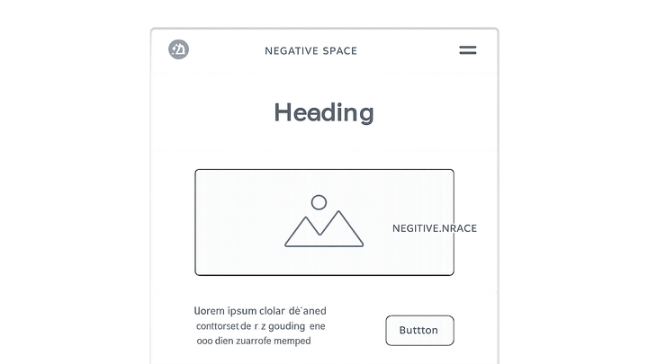
Negative space, also known as white space, is the empty area around and between design elements on a web page. It’s a foundational principle in web design that influences readability, visual hierarchy, and user engagement. Proper use of negative space directs the user’s eye to key elements like calls to action, forms, and headlines—ultimately boosting conversion rates. From a UX perspective, too little negative space can overwhelm users, while too much can dilute focus and reduce perceived value. In SEO terms, clean, well-spaced layouts improve scannability for both users and search engines. Tools like Prevue.me can analyze your page’s spacing patterns and provide actionable critiques to optimize lead generation, accessibility, and overall site performance.
Negative space
Negative space is the empty area around page elements that improves readability, guides focus, and boosts CRO, UX, and SEO.
Why Negative Space Matters
Negative space is more than just empty area—it’s an active element of your design that shapes how users perceive and interact with your content. By strategically placing negative space, you can guide attention, create a sense of elegance, and reduce cognitive load.
-
Enhancing readability and focus
Adequate spacing around text blocks and images makes content easier to scan and digest. Headlines, paragraphs, and visuals surrounded by breathing room improve comprehension and retention.
-
Boosting conversion rates
In CRO, negative space around CTAs and form fields reduces distractions and highlights the desired action. Well-spaced buttons and inputs can increase click-through and submission rates.
-
Improving accessibility and seo
Clean layouts with generous spacing support screen readers and keyboard navigation. Search engines favor pages that deliver a clear structure and user-friendly experience.
Evaluating Negative Space
Assessing negative space involves both automated tools and user feedback. A comprehensive evaluation ensures your design communicates clearly at every viewport.
-
Using prevue.me for automated critiques
prevue.me scans your live pages to identify areas with too little or too much spacing. It provides prioritized, actionable recommendations to refine margins, padding, and element grouping for optimal lead generation.
-
User testing and heatmaps
Heatmaps and eye-tracking studies reveal where users focus and where they skip. Analyze click maps to verify if negative space is guiding users toward your most important elements.
Best Practices and Guidelines
Implementing negative space effectively requires consistency, responsiveness, and an understanding of content density. Follow these guidelines to create balanced, engaging layouts.
-
Consistent margins and padding
Define a spacing scale (e.g., 8px, 16px, 32px) and apply it uniformly across components. Consistency fosters visual harmony and predictability.
-
Responsive design considerations
Adjust negative space at different breakpoints to maintain readability and focus on mobile, tablet, and desktop views. Test breakpoints to ensure no section feels cramped or overly sparse.
-
Balancing content density
Avoid clutter by limiting the number of elements per section. Group related items and separate distinct areas with clear whitespace to help users process information.
-
Practical html implementation
Example HTML structure illustrating negative space usage:
<div class="hero" style="padding: 80px 20px;">
  <h1>Welcome to Our Service</h1>
  <p>Optimize your experience with clear layout and breathing room.</p>
  <button>Get Started</button>
</div>
