Published on 2025-06-29T19:50:23Z
What is Webinar Signup? Examples and Best Practices
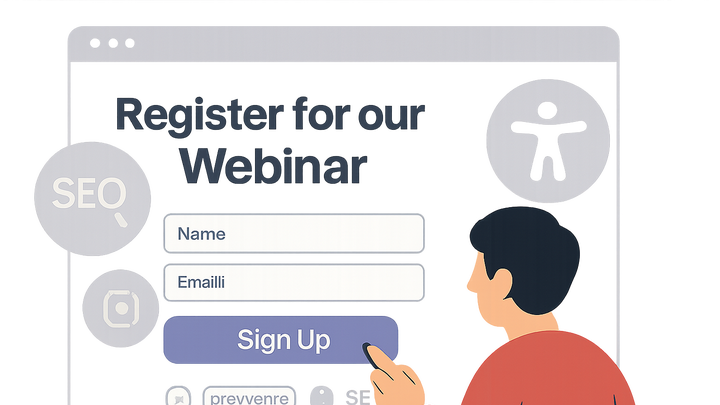
Webinar signup refers to the process by which visitors register for an online seminar or event. It typically involves a dedicated landing page or form where prospects provide their information, such as name and email address, to secure access to the webinar.
In the context of Conversion Rate Optimization (CRO), User Experience (UX), and Search Engine Optimization (SEO), optimizing the webinar signup flow is critical for maximizing lead generation and engagement. A seamless, accessible, and well-structured signup page can significantly boost conversions, improve SEO rankings through well-optimized content, and deliver a positive user experience across devices.
Tools like prevue.me can provide actionable critiques on CRO, lead generation, SEO, UX, and accessibility to ensure your signup page performs at its best. By addressing common pain points such as form complexity, unclear calls-to-action, and slow loading times, you can drive higher participation rates and grow your audience more effectively.
Webinar signup
The process and optimization of capturing webinar registrations through landing pages to boost conversions, UX, accessibility, and SEO.
Why Webinar Signups Matter for CRO, UX, and SEO
Webinar signups are more than just data collection points; they represent critical touchpoints that influence your conversion metrics, the quality of user experience, and your search visibility. Each signup is an opportunity to engage a qualified lead and move them further down the funnel.
-
Driving conversions
A well-optimized webinar signup page can significantly increase the percentage of visitors who convert into leads or attendees.
- Clear value proposition:
Highlight the benefits of attending the webinar to motivate signups.
- Minimized friction:
Reduce the number of required fields to streamline the registration process.
- Clear value proposition:
-
Enhancing user experience
Smooth and intuitive signup flows build trust and encourage users to complete the registration without frustration.
- Intuitive design:
Use consistent layout and clear labels to guide users through the process.
- Responsive layout:
Ensure the form renders correctly on all devices, including mobile and tablets.
- Intuitive design:
-
Boosting seo performance
Optimized webinar landing pages contribute to higher search rankings by providing valuable content and fast-loading experiences.
- Keyword-optimized copy:
Include relevant keywords in your headlines and descriptions.
- Fast load times:
Compress images and leverage caching to improve page speed.
- Keyword-optimized copy:
Key Components of an Effective Webinar Signup Page
Certain elements are essential for creating a signup page that converts. Prioritizing clarity, trust, and simplicity ensures visitors understand the offer and feel confident registering.
-
Compelling headline
The first thing visitors see should immediately communicate the webinar’s value and relevance.
- Clarity:
Use straightforward language that conveys what the webinar is about.
- Benefit-driven:
Emphasize outcomes attendees will gain by joining.
- Clarity:
-
Optimized form fields
Strike a balance between gathering necessary information and keeping the process quick and easy.
- Minimal required fields:
Only ask for the most critical information, like name and email.
- Progressive profiling:
Collect additional details in follow-up interactions instead of upfront.
- Minimal required fields:
-
Strong call-to-action (cta)
Your CTA button should stand out and use action-oriented language to encourage clicks.
- Action-oriented language:
Use verbs like
Reserve Your SpotorJoin the Webinar. - Visual contrast:
Choose a button color that pops against the background.
- Action-oriented language:
Common Pitfalls and How to Avoid Them
Even small mistakes on a signup page can deter potential attendees. Identifying and addressing these pitfalls helps maintain high conversion rates and a smooth user experience.
-
Overwhelming form length
Long forms increase friction and abandonment rates.
- Ask only essentials:
Limit fields to the bare minimum required for registration.
- Use multi-step forms:
Break the form into steps to make it feel less daunting.
- Ask only essentials:
-
Vague ctas
Ambiguous calls-to-action fail to guide users effectively.
- Be specific:
Clearly state the action and benefit, e.g.,
Get Instant Access. - Highlight the value:
Reinforce why users should click, such as
Free Expert Strategies.
- Be specific:
-
Neglecting accessibility
Excluding accessibility considerations can alienate users with disabilities and harm SEO.
- Keyboard navigation:
Ensure all form elements are reachable and operable via keyboard.
- Aria labels:
Use ARIA attributes to describe form fields for screen readers.
- Keyboard navigation:
Example: Optimizing Webinar Signup with prevue.me
prevue.me offers a platform to audit your signup page and provides targeted recommendations for CRO, UX, SEO, and accessibility improvements.
-
Automated cro critiques
prevue.me analyzes conversion bottlenecks and suggests specific changes to increase signups.
- Conversion rate benchmarks:
Compare your current signup rates against industry averages.
- Conversion rate benchmarks:
-
Ux and accessibility feedback
Receive in-depth reviews of your form’s usability and compliance with accessibility standards.
- Accessibility score:
Identify issues like color contrast failures and missing ARIA labels.
- Accessibility score:
-
Seo recommendations
Get guidance on optimizing your page’s metadata, headings, and content structure for search visibility.
- Meta tag suggestions:
Improve title and description tags to boost click-through rates.
- Meta tag suggestions:
