Published on 2025-06-29T21:55:42Z
What is eCommerce Mobile Navigation? Examples and Best Practices
eCommerce mobile navigation refers to the interface patterns and UI components that help shoppers find and browse products on a mobile-optimized website or app. With limited screen real estate and different touch interactions, mobile navigation must be streamlined and intuitive to guide users directly to products, categories, search, and cart functions. Poor navigation design can lead to frustration, high bounce rates, and lost sales opportunities. Conversely, a well-structured mobile navigation improves user experience (UX), boosts conversion rate optimization (CRO), and positively impacts search engine optimization (SEO) by increasing engagement metrics. Common patterns include hamburger menus, bottom navigation bars, persistent search bars, and quick-access icons. SaaS solutions like Prevue.me can provide targeted critiques of your eCommerce mobile navigation, highlighting issues in accessibility, UX, CRO, and SEO, and offering actionable recommendations.
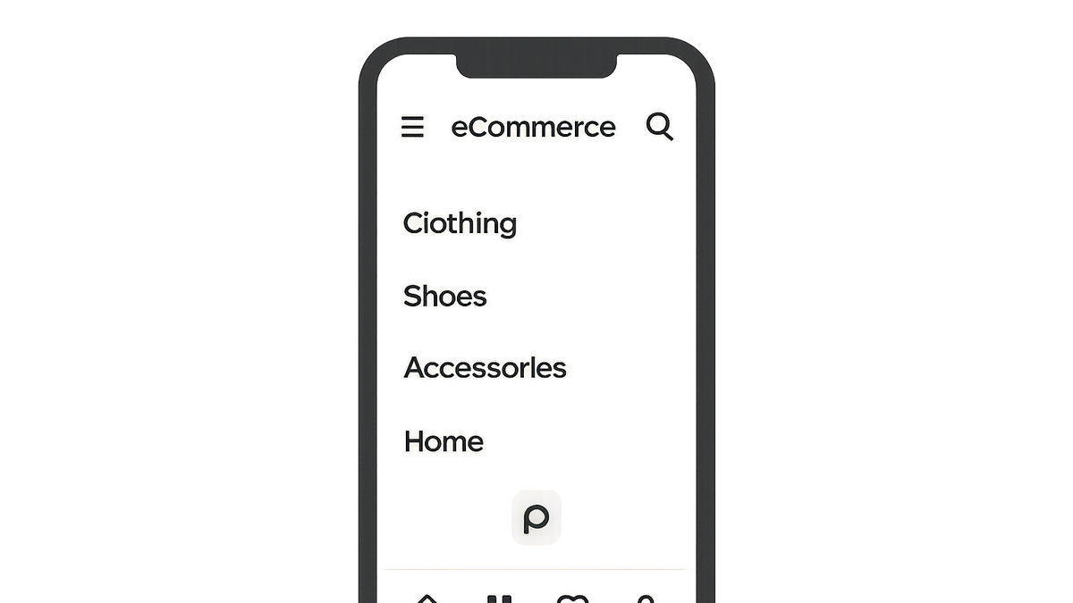
Ecommerce mobile navigation
Design patterns and best practices for eCommerce mobile navigation, optimizing UX, CRO, and SEO.
Why eCommerce Mobile Navigation Matters
Mobile navigation plays a critical role in guiding users through your product catalog and checkout process on handheld devices.
-
User experience (ux)
Intuitive navigation helps users find products quickly, reducing frustration and drop-offs.
- Reduced bounce rate:
Clear navigation paths keep users engaged, lowering bounce rates.
- Improved engagement:
Easy-to-use menus encourage deeper browsing and longer sessions.
- Reduced bounce rate:
-
Conversion rate optimization (cro)
Streamlined navigation reduces friction in the purchase funnel, increasing conversions.
- Shorter paths to purchase:
Minimizing taps to checkout accelerates the buying process.
- Visible ctas:
Well-placed call-to-action buttons guide users towards transactions.
- Shorter paths to purchase:
-
Search engine optimization (seo)
Good navigation structure improves site crawlability and user metrics that search engines value.
- Enhanced crawlability:
Logical menu hierarchies help search bots index pages effectively.
- Lower bounce signals:
Engaged users signal quality to search engines, boosting rankings.
- Enhanced crawlability:
Key Components of Mobile Navigation
Explore common patterns and UI elements that make up an effective eCommerce mobile navigation.
-
Hamburger menu
A collapsible menu that hides navigation links behind an icon, saving screen space.
- Pros and cons:
Pros: uncluttered UI; Cons: hidden options may reduce discoverability.
- Best use cases:
Suitable for sites with many categories or limited screen width.
- Pros and cons:
-
Bottom navigation bar
A fixed bar at the bottom with key links (home, search, categories, cart, profile).
- Thumb-friendly:
Easily reachable by thumbs on large screens.
- Icon clarity:
Use clear, universally understood icons.
- Thumb-friendly:
-
Persistent search
Always-visible search input or icon for direct product lookup.
- Instant suggestions:
Show autocomplete to speed up search tasks.
- Voice search:
Consider voice input for hands-free convenience.
- Instant suggestions:
-
Quick-access icons
Direct links to cart, wishlist, or offers for fast access.
- Badge notifications:
Display item counts on cart icons.
- Contextual shortcuts:
Offer quick links based on user behavior or promotions.
- Badge notifications:
Best Practices for eCommerce Mobile Navigation
Guidelines to optimize mobile navigation for clarity, speed, and conversion.
-
Simplify hierarchies
Limit menu levels and group related categories to reduce complexity.
-
Use clear labels
Avoid ambiguous terms; use descriptive labels users understand.
-
Optimize touch targets
Ensure buttons and links are at least 44×44 pixels for accessibility.
-
Prioritize search
Place search prominently to cater to users who know what they want.
Example Code Snippet
Sample HTML markup for a basic eCommerce mobile navigation pattern.
-
Html structure example
<nav class='mobile-nav'>
  <button class='navbar-toggle'>Menu</button>
  <ul class='menu'>
    <li><a href='/'>Home</a></li>
    <li><a href='/shop'>Shop</a></li>
    <li><a href='/cart'>Cart</a></li>
  </ul>
</nav>
Using Prevue.me for Critiques
Leverage prevue.me to audit and improve your eCommerce mobile navigation from multiple angles.
-
Ux and accessibility audits
Get detailed feedback on navigation clarity, touch target sizes, and screen-reader compatibility.
-
Cro and lead generation analysis
Identify friction points in the navigation flow to optimize conversion paths and increase leads.
-
Seo impact assessment
Evaluate how your navigation structure affects crawlability and page discoverability.